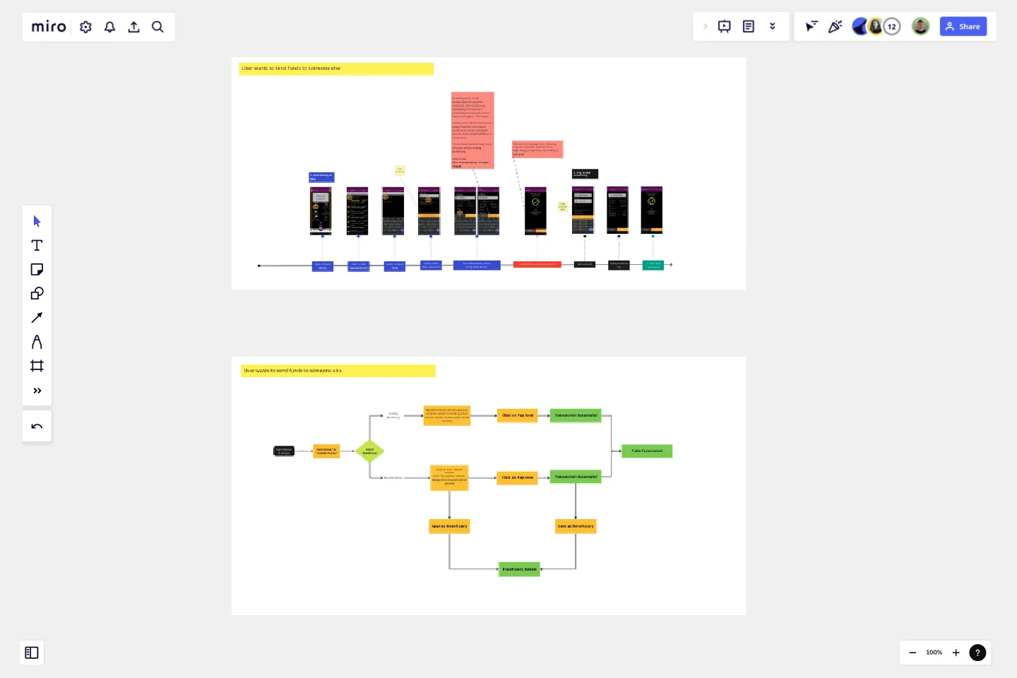
Bank Mobile App User Journey
This template serves as a comprehensive visualization tool for mapping out the user journey and user flow of a product, offering a structured approach to understanding and improving the user experience.
This template follows a two-step process, beginning with the depiction of the current user journey followed by the creation of the proposed user flow.
Understanding the current user journey is an essential first step. It involves meticulously mapping out the various touchpoints, interactions, and experiences a user goes through when engaging with a product or service. By visually representing this existing journey, it becomes easier to identify pain points, bottlenecks, and areas where user satisfaction can be enhanced. This process allows stakeholders to gain a holistic perspective of the user's experience, pinpointing areas that require optimization.
Once the existing user journey is thoroughly documented, the template moves on to the proposed user flow. This step entails envisioning an improved user experience by redesigning the sequence of actions and interactions within the product. It allows for the incorporation of user-centered design principles, best practices, and innovative ideas. By creating a user flow that aligns more closely with the desired user experience, the template empowers teams to conceptualize and communicate how the product should ideally function.
The template's visual format is a valuable asset in presenting findings and recommendations to stakeholders and team members. It enhances clarity and fosters collaboration by providing a common visual language for discussing user experience improvements. It serves as a tangible reference point for ongoing discussions and decisions related to the product's development.
Moreover, the template is adaptable to various stages of product development. Whether you are starting from scratch, redesigning an existing product, or implementing incremental improvements, it can accommodate your needs. It promotes an iterative approach to design, allowing teams to revisit and refine the proposed user flow as the project progresses or user feedback is gathered.
In conclusion, this user journey and user flow template is a versatile tool that promotes a user-centric design approach. It facilitates the exploration of the current user experience landscape and guides the envisioning of an improved user flow. By utilizing this template, product teams can foster better communication, enhance collaboration, and ultimately create products that resonate with users and exceed their expectations.
This template was created by Muhammad Mohsin.
Get started with this template right now.
BPMN 2.0
Works best for:
Diagramming
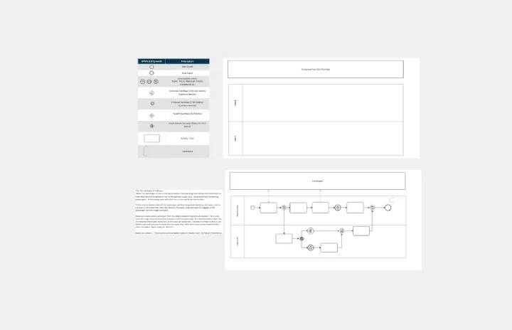
The BPMN 2.0 template offers a visual notation for modeling business processes using the Business Process Model and Notation (BPMN) standard. It provides elements for defining process flows, activities, and decision points. This template enables teams to document and analyze business processes systematically, facilitating process optimization and automation. By promoting standardization and clarity in process modeling, the BPMN 2.0 template empowers organizations to improve efficiency, agility, and compliance in their operations.
Supply and Demand Graph Template
Works best for:
Market Research, Mapping, Diagrams
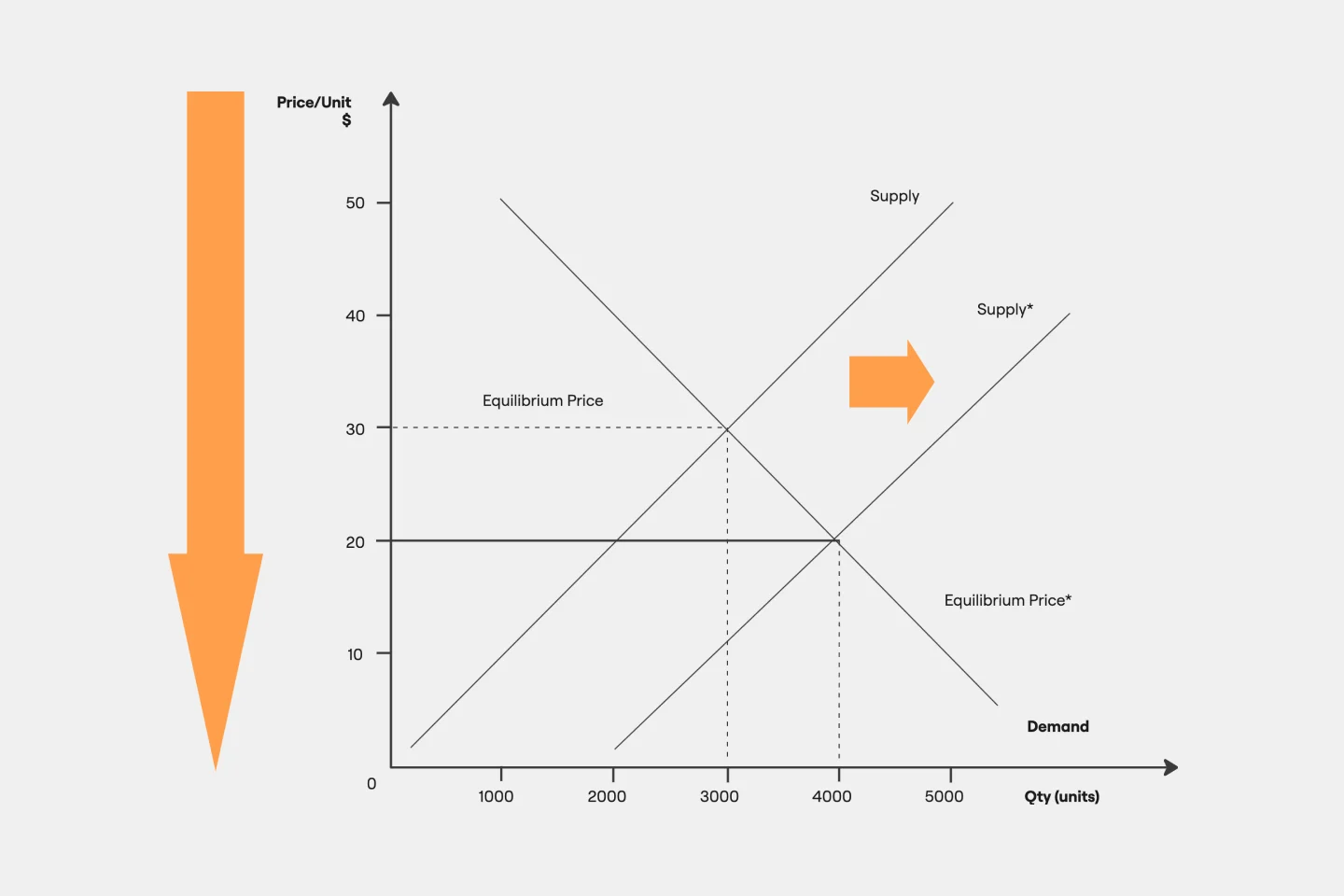
How do you price your product so that you make a profit while keeping customers and manufacturers happy? By finding a fair price. A supply and demand diagram is a graph that visualizes how much demand there is for your product and how many products you need. This, in turn, helps you with product pricing.
UML Class Messaging System Template
Works best for:
UML
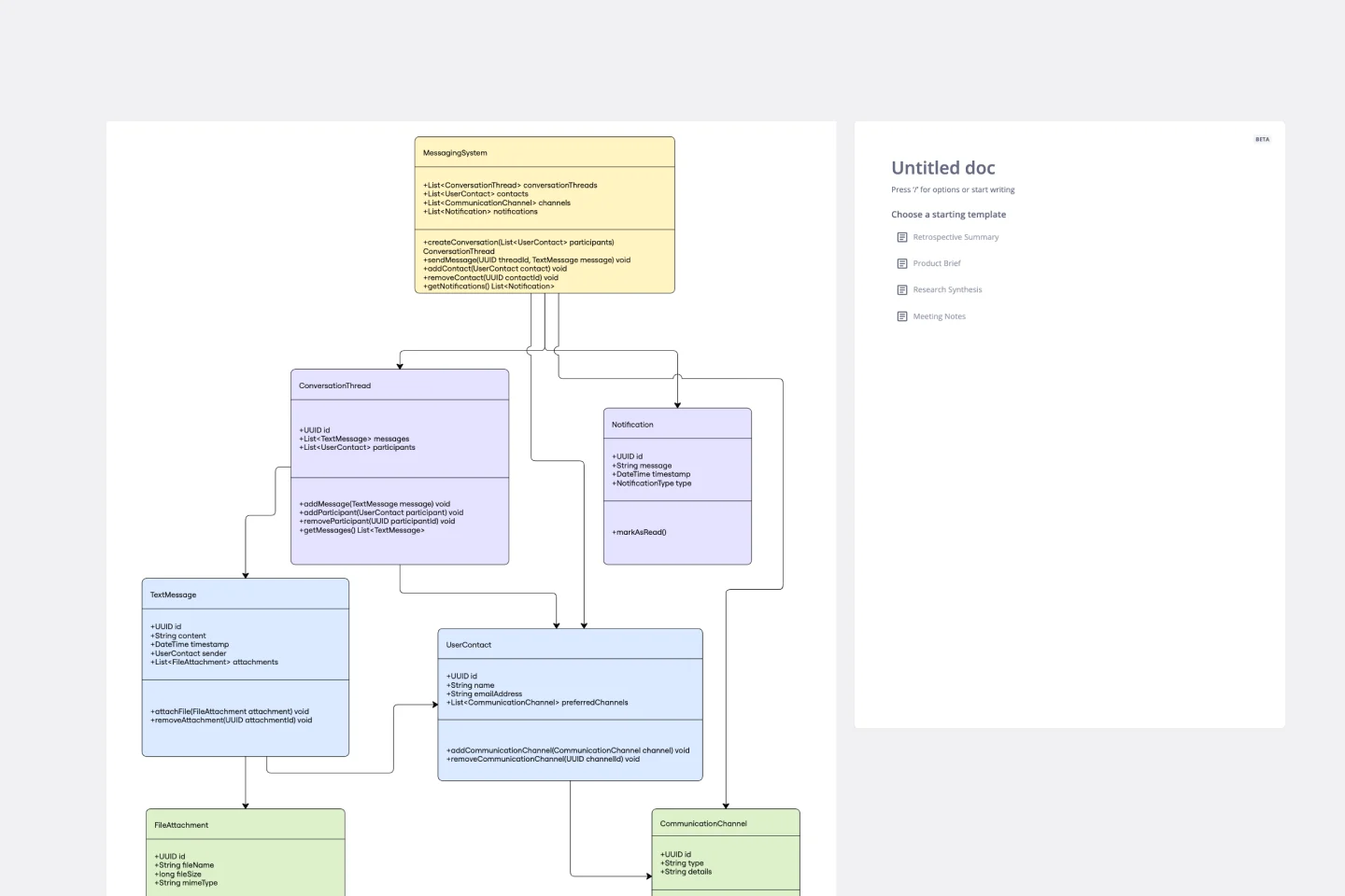
The UML Class Messaging System Template streamlines the process of designing and analyzing messaging systems. It allows users to visually map out the structure of a system by detailing classes, their attributes, operations, and the relationships among objects. This template is particularly useful for illustrating the functionality of a messaging system, including the management of text messages, conversation threads, user contacts, notifications, and channels. It offers a clear visual representation of how all these elements interact within the system, making it an invaluable resource for developers, designers, and stakeholders aiming to enhance communication and reduce errors in the development phase.
Flow Diagrams
Works best for:
Diagramming
The Flow Diagrams template offers a versatile tool for visualizing processes, workflows, and systems. It provides a range of shapes and connectors for creating flowcharts, process maps, and data flow diagrams. This template enables teams to represent complex systems and processes in a clear and structured manner, facilitating communication and decision-making. By promoting visual clarity and understanding, Flow Diagrams empower teams to analyze and optimize processes effectively, driving efficiency and productivity.
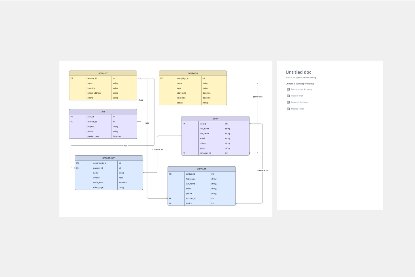
ERD Customer Relationship Management (CRM) Template
Works best for:
ERD, CRM
The ERD Customer Relationship Management (CRM) template streamlines and enhances the management of customer relationships within businesses. It focuses on organizing customer information and interactions in a visually intuitive manner. Key entities such as Customer, Interaction, Sales Opportunity, Product, and Support Ticket are central to the template, facilitating the tracking of customer relationships, sales funnel activities, product purchases, and customer service interactions. This structured approach is critical for boosting customer satisfaction and optimizing sales strategies, making the ERD CRM template an invaluable asset for businesses aiming to improve their CRM processes.
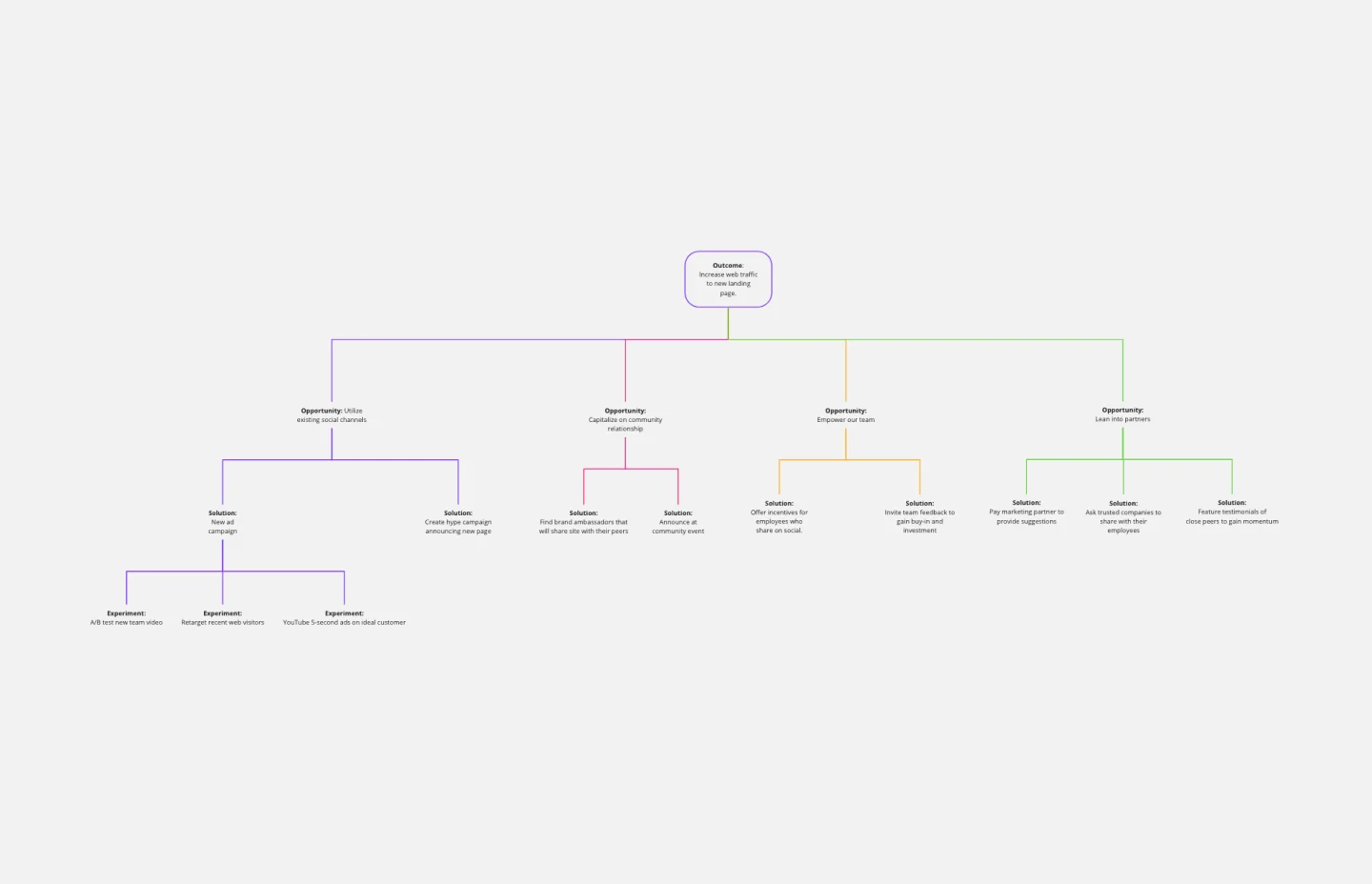
Opportunity Solution Tree Template
Works best for:
Flowcharts, Product Management, Diagrams
Solving problems — successful companies and productive teams just know how to do it. They’re able to identify many possible solutions, then settle on the one that leads to the desired outcome. That’s the power an Opportunity Solution Tree gives you. Designed by Teresa Torres, a product discovery coach, this mind map breaks down your desired outcome into opportunities for the product to meet user needs, then gives your team an effective way to brainstorm potential solutions.