Supply and Demand Graph Template
Determine the right price points for your products and services with a supply and demand graph template. Understand how to price your products in a way that's affordable for consumers — and profitable for the business.
Trusted by 65M+ users and leading companies


About the Supply and Demand Graph Template
Miro’s supply and demand graph template is a ready-to-use diagram designed to help you price your products strategically. By seeing where market demand meets supply, you’ll be better equipped to pinpoint the sweet spot for your prices — affordable enough for your customers and profitable for your business.
We’ll walk you through how to make the most of the supply and demand graph template and point out the unique benefits that come with filling it out in Miro.
How to use Miro’s supply and demand graph template
Ready to use the supply and demand graph template? Get started by clicking on the blue “Use template” button on the page to open the template up in Miro. Once you’re in, follow the steps below:
1. Gather the data
You’ll need data to populate the supply and demand graph template, so pull up a spreadsheet. In Miro, you can easily embed your spreadsheets right on your board — allowing you to fill the template in without having to go back and forth to get data. Just head to the toolbar, click “More apps,” look for “Upload,” and choose how you’d like to import your spreadsheet.
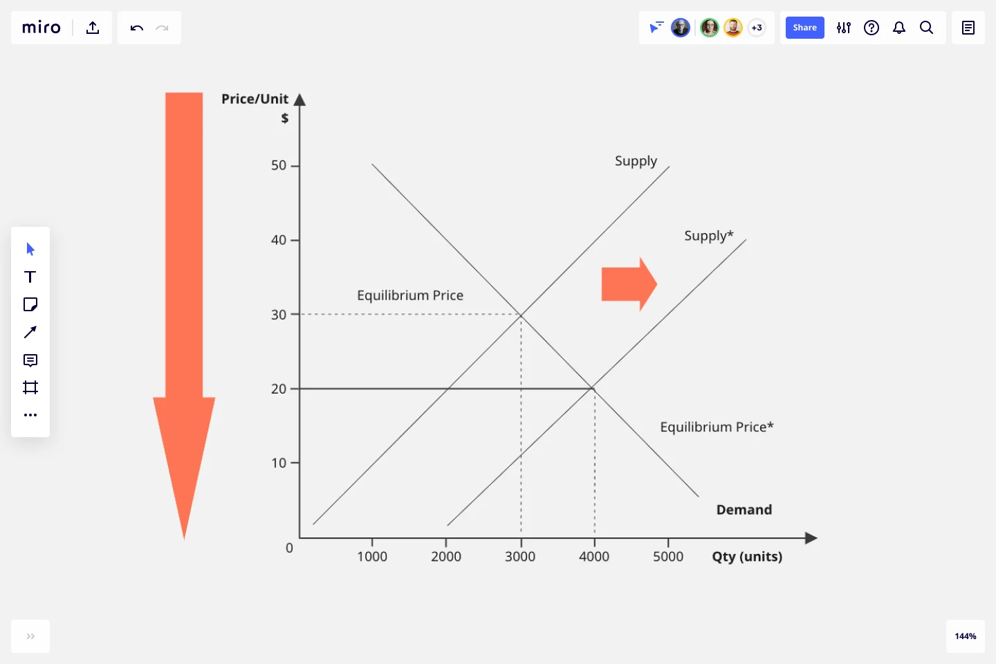
2. Edit the axes
The template comes with a pre-made X-axis representing the product quantity and a Y-axis representing the price per unit. Take a look at the values and measurement units along the axes and edit them if needed. For example, if you’re measuring your prices in the Euro (EUR), double-click on the ‘$’ symbol to replace it with a ‘€’ symbol.
3. Adjust the curves
Click and drag the pre-made supply and demand curves to adjust their position on the diagram based on your data — making sure both curves intersect at some point.
To lengthen a curve, click on it once to reveal the two white dots on each end, then click and drag either dot until the line is as long or short as you want it to be. You can use the blue dot in the middle of the line to adjust the arch of the curve.
4. Mark the equilibrium point
See where the curves intersect on the diagram? You’ll need to mark that as the equilibrium point by drawing lines from the two axes toward it. Luckily, the supply and demand graph template already comes with a few lines like these, so all you’ll have to do is adjust their lengths and positions on the diagram.
5. Customize the template
Your supply and demand diagram should be easy and inviting to read, so feel free to customize its look and feel. Try changing text colors, font types, or line styles and thickness. You can even add sticky notes to include important context about the supply and demand diagram — just press N on your keyboard.
Taking the time to customize the template can be especially helpful if you’ll be sharing it with senior stakeholders and need to keep up with brand guidelines.
Benefits of using Miro’s supply and demand graph template
Accessing Miro’s supply and demand graph template doesn’t just save you time from having to build a diagram from scratch but also grants you access to our visual workspace for innovation — packed with intuitive diagramming tools and next-level collaboration features.
Easily collaborate on the template with teammates by inviting them to edit your Miro board with you in real time — even if you aren’t in the same room. Prefer to work async? Share your board when you’re ready and have others view and comment on your diagram, and keep each other in the loop by tagging the right people.
Need to present your supply and demand diagram to others? Use Presentation Mode to run live and engaging sessions right from your Miro board, complete with interactive features to maximize participation. Not up for another meeting? Use TalkTrack to record immersive audio and video walkthroughs and share these as interactive sessions people can watch in their own time.
Last but not least, you’ll want to keep your template up to date as market conditions change. With a supply and demand graph maker like Miro, it’s easy to make changes and keep everyone informed in real time — making sure everyone on the Miro board has the same source of truth at all times.
Is Miro’s supply and demand graph template free?
Yes, the supply and demand graph template is free and fully customizable. Just click on the “Use template” button to create a free account and open the template in Miro.
Why create a supply and demand diagram?
Understanding supply and demand is helpful for determining the prices and quantities of goods and services on the market. More specifically, it helps businesses understand what their customers want — allowing them to set their products and services at reasonable price yet profitable prices.
How can I share my supply and demand diagram with others?
Absolutely. When you’re done filling in the supply and demand graph template, you can choose from multiple ways to share it. Export it as a PDF or image by heading to the “Main menu” at the top of your Miro board, clicking “Export” and choosing a file format. You can also generate a shareable link or an embed code. Alternatively, invite others to view and comment on your Miro board, allowing you to get instant feedback and make any necessary changes — all in one place.
Get started with this template right now.
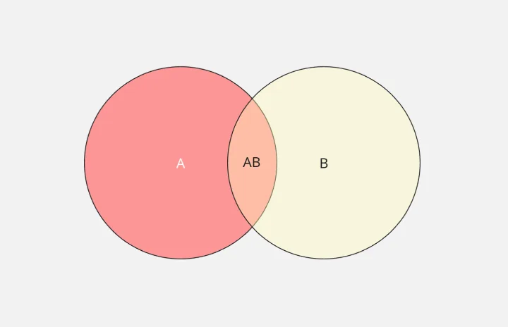
2-Circle Venn Diagram Template
The 2 Circle Venn Diagram Template is a dynamic, intuitive tool designed to represent the logical relationships between two data sets visually. For teams, this template proves valuable in enabling efficient collaboration, clear communication, and shared understanding.
Affinity Diagram by UserPeek
Works best for:
Diagramming
The Affinity Diagram template is a visual tool for organizing and categorizing ideas, data, or issues into related groups. It provides a structured framework for conducting group brainstorming and affinity grouping activities. This template enables teams to synthesize information, identify patterns, and generate insights collaboratively. By promoting creativity and collaboration, the Affinity Diagram empowers teams to organize and prioritize information effectively, driving decision-making and problem-solving processes efficiently.
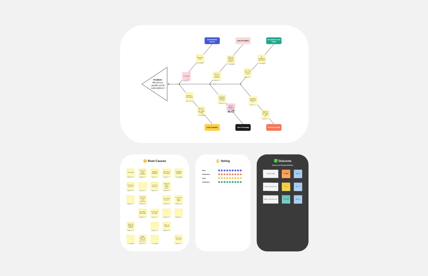
Fishbone Diagram Template
Works best for:
Operations, Diagrams, Workflows
What is the best way to solve any problem your team faces? Go straight to the root. That means identifying the root causes of the problem, and fishbone diagrams are designed to help you do it best. Also known as the Ishikawa Diagram (named after Japanese quality control expert Kaoru Ishikawa), fishbone diagrams allow teams to visualize all possible causes of a problem, to explore and understand how they fit together holistically. Teams can also use fishbone diagrams as a starting point for thinking about what the root cause of a future problem might be.
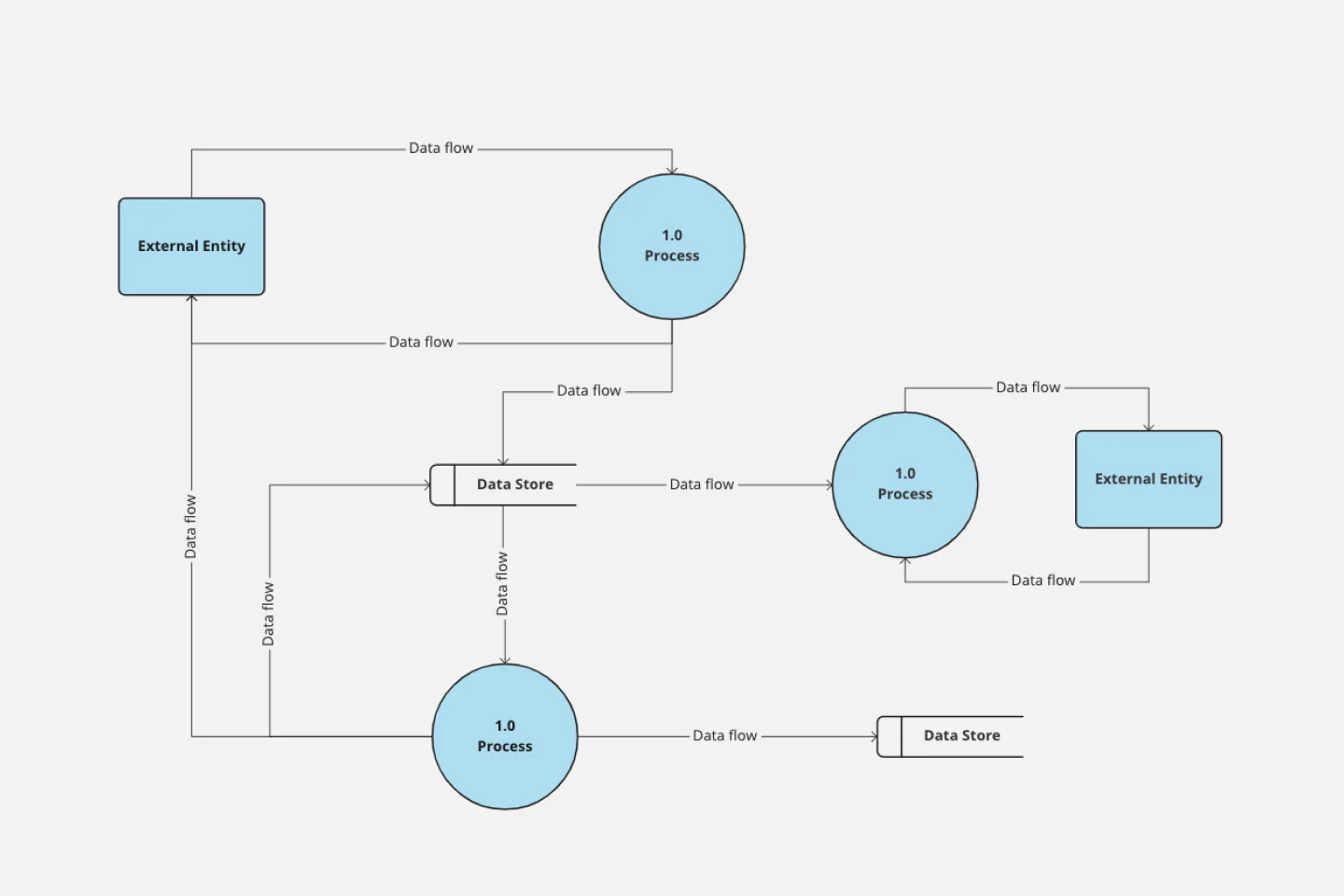
Data Flow Diagram Template
Works best for:
Flowcharts, Software Development, Diagrams
Any process can get pretty complex, especially when it has multiple components. Get a better grasp of your process through a data flow diagram (DFD). DFDs create a simple visual representation of all components in the flow of data and requirements in an entire system. They’re most often used by growth teams, data analysts, and product teams, and they’re created with one of three levels of complexity—0, 1, or 2. This template will help you easily build the best DFD for your process.
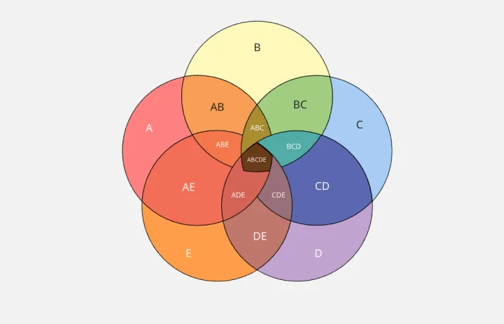
5-Circle Venn Diagram Template
Works best for:
Diagramming, Mapping, Brainstorming
Discover how Miro's 5 Circle Venn Diagram Template can simplify complex decision-making processes. Learn how to create, customize, and share your diagrams for effective visual collaboration. Transform brainstorming sessions with real time, remote teamwork.
UML State Machine Diagram Template
Works best for:
Software Development, Mapping, Diagrams
Visualize the workflow of a process and how objects perform actions based on different stimuli. State machine diagrams are valuable for understanding how an object responds to events at the different stages of its life cycle. They are also helpful for visualizing event sequences in a system.