Supply and Demand Graph Template
Determine the right price points for your products and services with a supply and demand graph template. Understand how to price your products in a way that's affordable for consumers — and profitable for the business.
About the Supply and Demand Graph Template
Miro’s supply and demand graph template is a ready-to-use diagram designed to help you price your products strategically. By seeing where market demand meets supply, you’ll be better equipped to pinpoint the sweet spot for your prices — affordable enough for your customers and profitable for your business.
We’ll walk you through how to make the most of the supply and demand graph template and point out the unique benefits that come with filling it out in Miro.
How to use Miro’s supply and demand graph template
Ready to use the supply and demand graph template? Get started by clicking on the blue “Use template” button on the page to open the template up in Miro. Once you’re in, follow the steps below:
1. Gather the data
You’ll need data to populate the supply and demand graph template, so pull up a spreadsheet. In Miro, you can easily embed your spreadsheets right on your board — allowing you to fill the template in without having to go back and forth to get data. Just head to the toolbar, click “More apps,” look for “Upload,” and choose how you’d like to import your spreadsheet.
2. Edit the axes
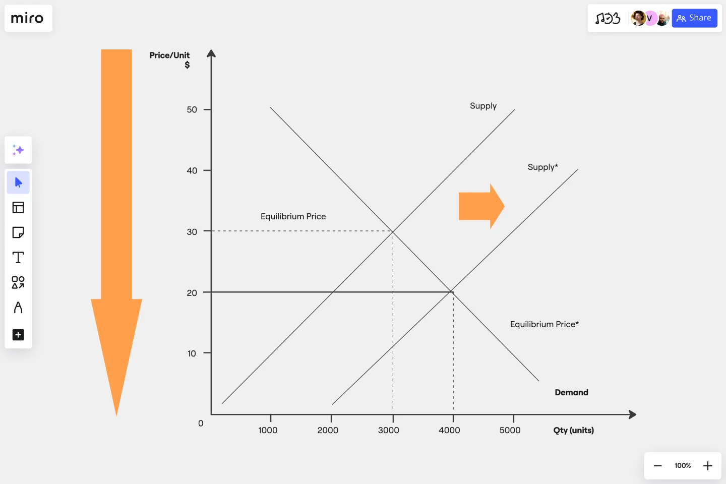
The template comes with a pre-made X-axis representing the product quantity and a Y-axis representing the price per unit. Take a look at the values and measurement units along the axes and edit them if needed. For example, if you’re measuring your prices in the Euro (EUR), double-click on the ‘$’ symbol to replace it with a ‘€’ symbol.
3. Adjust the curves
Click and drag the pre-made supply and demand curves to adjust their position on the diagram based on your data — making sure both curves intersect at some point.
To lengthen a curve, click on it once to reveal the two white dots on each end, then click and drag either dot until the line is as long or short as you want it to be. You can use the blue dot in the middle of the line to adjust the arch of the curve.
4. Mark the equilibrium point
See where the curves intersect on the diagram? You’ll need to mark that as the equilibrium point by drawing lines from the two axes toward it. Luckily, the supply and demand graph template already comes with a few lines like these, so all you’ll have to do is adjust their lengths and positions on the diagram.
5. Customize the template
Your supply and demand diagram should be easy and inviting to read, so feel free to customize its look and feel. Try changing text colors, font types, or line styles and thickness. You can even add sticky notes to include important context about the supply and demand diagram — just press N on your keyboard.
Taking the time to customize the template can be especially helpful if you’ll be sharing it with senior stakeholders and need to keep up with brand guidelines.
Benefits of using Miro’s supply and demand graph template
Accessing Miro’s supply and demand graph template doesn’t just save you time from having to build a diagram from scratch but also grants you access to our visual workspace for innovation — packed with intuitive diagramming tools and next-level collaboration features.
Easily collaborate on the template with teammates by inviting them to edit your Miro board with you in real time — even if you aren’t in the same room. Prefer to work async? Share your board when you’re ready and have others view and comment on your diagram, and keep each other in the loop by tagging the right people.
Need to present your supply and demand diagram to others? Use Presentation Mode to run live and engaging sessions right from your Miro board, complete with interactive features to maximize participation. Not up for another meeting? Use TalkTrack to record immersive audio and video walkthroughs and share these as interactive sessions people can watch in their own time.
Last but not least, you’ll want to keep your template up to date as market conditions change. With a supply and demand graph maker like Miro, it’s easy to make changes and keep everyone informed in real time — making sure everyone on the Miro board has the same source of truth at all times.
Is Miro’s supply and demand graph template free?
Yes, the supply and demand graph template is free and fully customizable. Just click on the “Use template” button to create a free account and open the template in Miro.
Why create a supply and demand diagram?
Understanding supply and demand is helpful for determining the prices and quantities of goods and services on the market. More specifically, it helps businesses understand what their customers want — allowing them to set their products and services at reasonable price yet profitable prices.
How can I share my supply and demand diagram with others?
Absolutely. When you’re done filling in the supply and demand graph template, you can choose from multiple ways to share it. Export it as a PDF or image by heading to the “Main menu” at the top of your Miro board, clicking “Export” and choosing a file format. You can also generate a shareable link or an embed code. Alternatively, invite others to view and comment on your Miro board, allowing you to get instant feedback and make any necessary changes — all in one place.
Get started with this template right now.
Stakeholder Mapping Template
Works best for:
Business Management, Mapping, Workflows
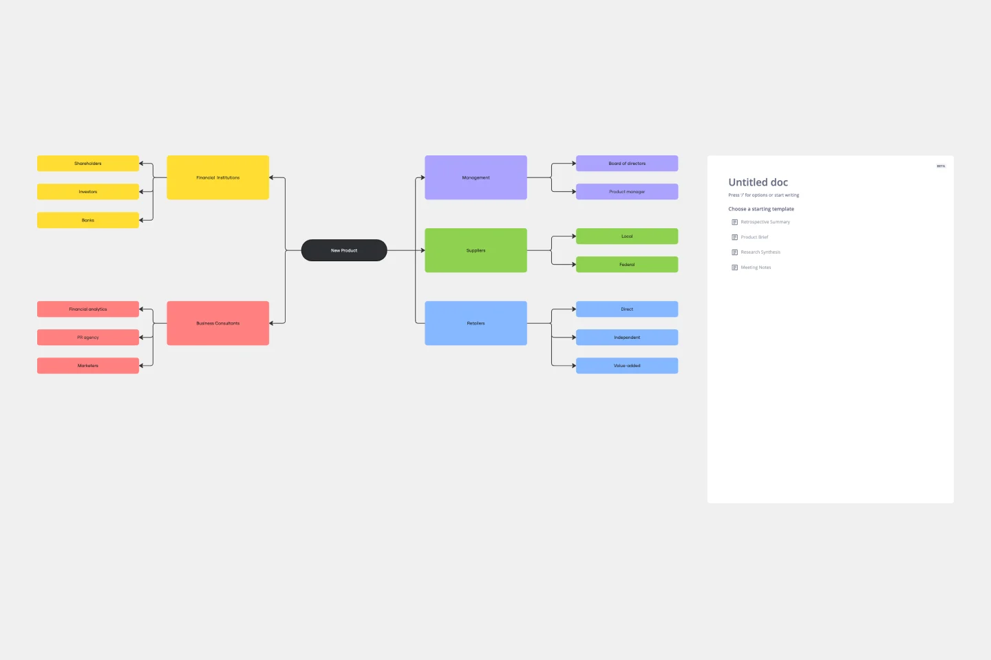
A stakeholder map is a type of analysis that allows you to group people by their power and interest. Use this template to organize all of the people who have an interest in your product, project, or idea in a single visual space. This allows you to easily see who can influence your project, and how each person is related to the other. Widely used in project management, stakeholder mapping is typically performed at the beginning of a project. Doing stakeholder mapping early on will help prevent miscommunication, ensure all groups are aligned on the objectives and set expectations about outcomes and results.
Strategy Map Template
Works best for:
Leadership, Strategic Planning, Mapping
How do your individual or team goals relate to an organization’s overall strategy? A Strategy Map is a stylized picture of your organization’s strategy and objectives. It’s powerful because it provides a clear visual guide to how these various elements work together. Strategy Maps can help align various different team goals with the overall strategy and mission. With the Strategy Map in place, teams can create set actionable, relevant KPIs. Strategy mapping is often considered part of the balanced scorecard (BSC) methodology, which is a strategic planning tool for setting overall team goals.
Influence Diagram Template
Works best for:
Business Management, Decision Making, Diagrams
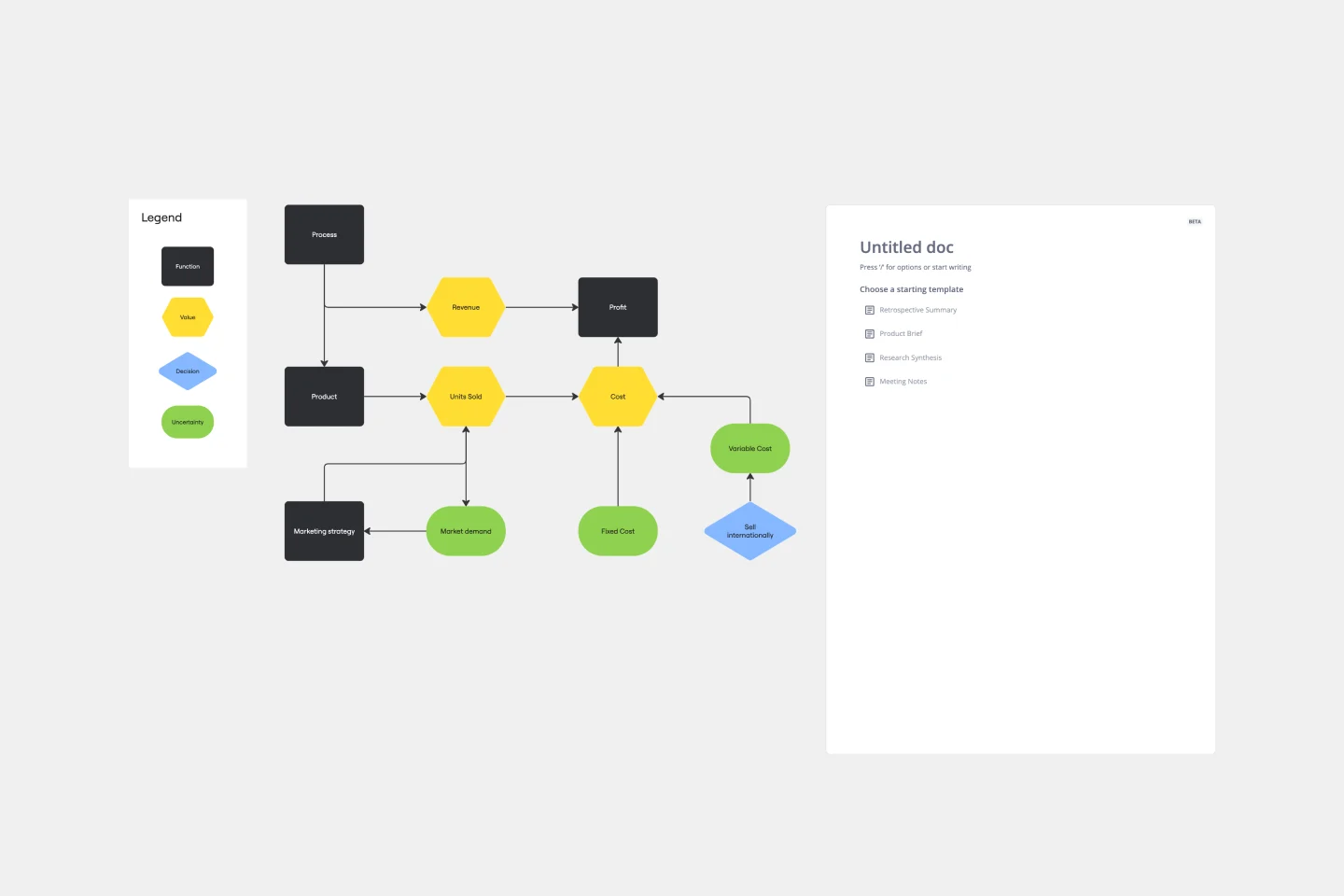
See the big picture of any business decision with this Influence Diagram Template. You’ll define the decision you have to make and brainstorm everything that could impact it. When you build connections between these factors, you’ll be able to put the right amount of weight into each one as you make your decision.
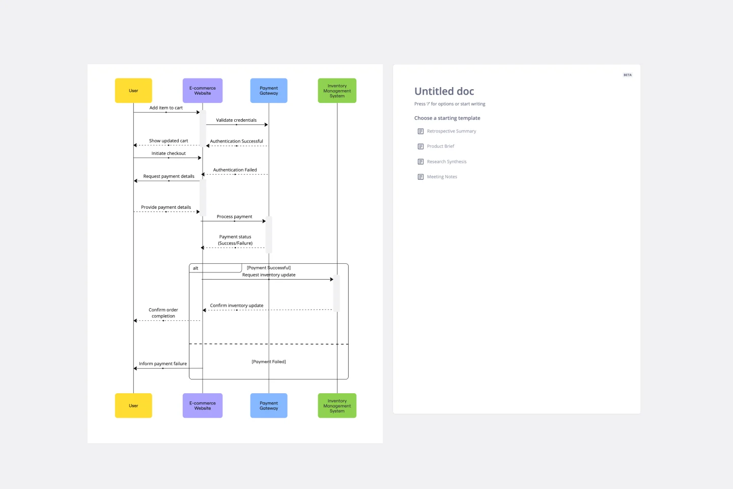
UML Sequence E-commerce Checkout Template
Works best for:
UML
The UML Sequence E-commerce Checkout Template in Miro is a versatile tool for visualizing and analyzing e-commerce checkout processes. It provides a step-by-step visual representation of system interactions, is highly customizable, supports real-time collaboration, and is suitable for various e-commerce platforms. It serves as an efficient documentation tool, fosters team collaboration, and contributes to a more streamlined checkout experience for customers.
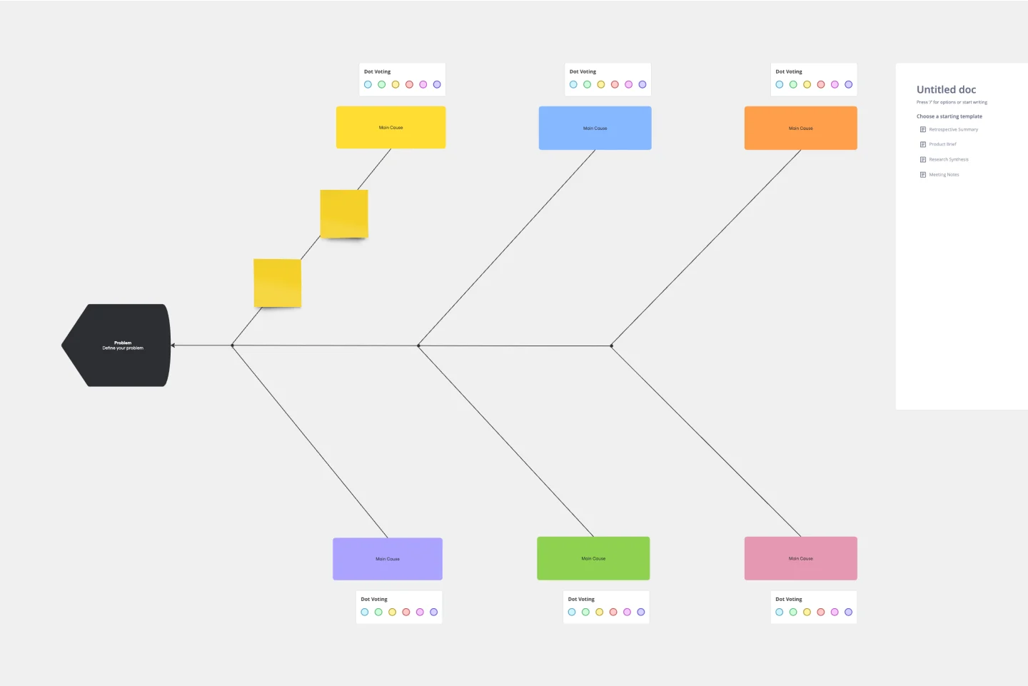
Fishbone Diagram Template
Works best for:
Operations, Diagrams, Workflows
What is the best way to solve any problem your team faces? Go straight to the root. That means identifying the root causes of the problem, and fishbone diagrams are designed to help you do it best. Also known as the Ishikawa Diagram (named after Japanese quality control expert Kaoru Ishikawa), fishbone diagrams allow teams to visualize all possible causes of a problem, to explore and understand how they fit together holistically. Teams can also use fishbone diagrams as a starting point for thinking about what the root cause of a future problem might be.
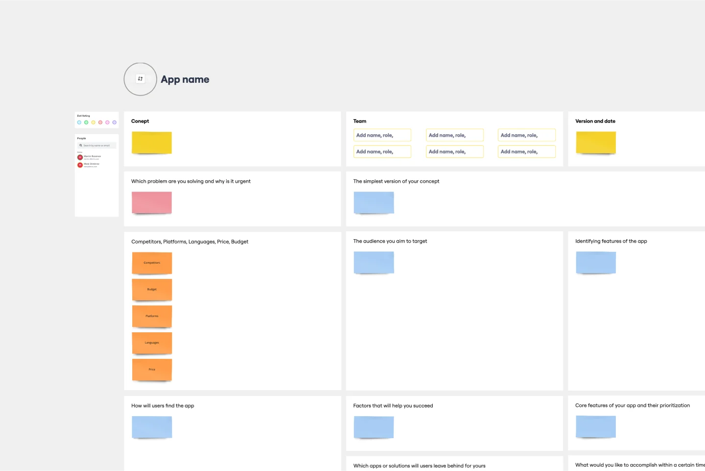
App Development Canvas Template
Works best for:
Market Research, Product Management, User Experience
Ever noticed that building a successful app requires lots of players and moving parts? If you’re a project manager, you definitely have. Lucky for you, an app development canvas will let you own and optimize the entire process. It features 18 boxes, each one focusing on a key aspect of app development, giving you a big-picture view. That way you can fine-tune processes and get ahead of potential problems along the way—resulting in a smoother path and a better, tighter product.