Spaghetti Diagram Template
Get an overview of a process and find areas of improvement
Trusted by 65M+ users and leading companies


About the Spaghetti Diagram Template
The Spaghetti Diagram Template can help you visualize the flow of people, materials, documentation, and products in your processes, as well as how these elements interact with each other.
Spaghetti diagrams are also part of LEAN tools, a set of problem-solving methods designed to increase process efficiency. These tools are particularly helpful when reengineering business processes.
This template enhances your understanding of a current process, helping you identify redundancies and spot areas for improvement. You can also use the template to map out a workflow before implementing a process change.
For example, you might use this template to map out a patient's experience at a hospital. You'll also want to include the management hierarchy for staff, emergency protocols, and information about the supplies needed in each department.
This way, employees at all levels of the organization can understand how their work processes fit into the hospital's process flow as a whole and identify areas that need improvement.
Keep reading to learn more about the Spaghetti Diagram template.
What is a spaghetti diagram?
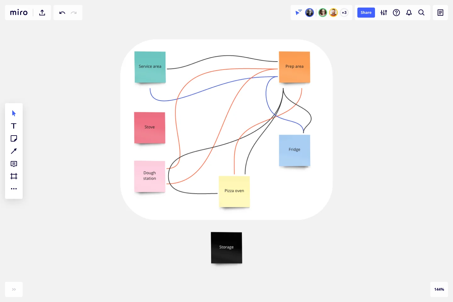
A spaghetti diagram, also known as “spaghetti chart,” “spaghetti plot,” or “spaghetti model,” is a visualization tool used in process mapping to show the flow of information, people, and products.
In a spaghetti diagram, each part of the process flow is represented as a strand. These strands come together at decision points or "intersections" to form a network.
A set of tasks are represented by colorful, semi-transparent strands that connect up to show how they're related in time, space, or agreement with one another.
For instance, let's say you are designing a website and want to plan out the basic page flow. You could represent each web page as one of the noodles in the diagram, and then you could show which pages link to one another (dependencies) with connecting noodles.
Or you could show what pages people visit before they purchase a certain product, what steps are involved in the purchasing process (work sequences), and who they're working with (agreements) during the purchasing process.
In short, a spaghetti plot is a quick and easy way to track distances between parts, people, or work that otherwise would be hard to represent.
Benefits of using a Spaghetti Diagram Template
Some of the benefits of spaghetti diagrams include:
Quickly identify process waste and inefficiencies: Since spaghetti diagrams are simple and easy to read, it's easy to identify problems quickly and improve the quality of a process.
Identify non-value added time: Since the spaghetti diagram freezes work-in-progress for a particular time slice, you can see how much time is actually spent doing standard work versus how much time is wasted organizing tasks or attending.
Keep everyone on the same page: This diagram can be helpful when you want to visually track work that needs to be done between different departments or stakeholders and make sure everyone’s on the same page.
Track the working schedule of people and machines: When there are multiple work areas or production lines, a spaghetti diagram can help you track everyone’s and everything’s working schedule.
Maximize productivity: Since spaghetti diagrams (can) provide a quick way to see and understand the big picture, you can make sure everyone is working on things that are most important.
Create your own spaghetti diagram
With Miro, you can create your own spaghetti diagram in minutes. Get started by opening our Spaghetti Diagram Template.
This template comes pre-loaded with sticky notes and connector lines.
Step 1: Start by adding your first noodle or set of tasks. Begin to build the spaghetti diagram by adding other noodles.
Step 2: Drag and drop noodles to connect them to each other, or move noodles by dragging them around on the canvas. The connector lines will adjust automatically to maintain the connection.
Step 3: Add a sticky note by double-clicking on a noodle and typing in the text of your choice. You can also move the note by dragging it around on the canvas.
Step 4: When you're done, simply save your spaghetti diagram and share it with any relevant team members.
With Miro, collaborating with team members is pretty straightforward. You can invite your team to collaborate on a specific template and edit your data in real-time.
Example of a spaghetti diagram in action
Let’s imagine that you’re the owner of a car manufacturing company and want to improve your stamping process. Let’s also imagine that your stamping process has four steps:
Find the type of metal the part should be made from
Punch out the corresponding shapes
Stamp or punch out additional shapes
Clean up the final product
To manage this process, you create a spaghetti diagram with four noodles labeled ‘1’ through ‘4’. You then create four labels on each noodle that say ‘Metal Type,’ ‘Punch Shapes,’ ‘Stamp Shapes,’ and ‘Cleanup.’
You then color code each label with the same color as the noodle it’s on and finish by drawing connection lines between each step.
This allows you to visualize your entire stamping process and understand how the different steps connect.
What is a spaghetti diagram used for?
A spaghetti diagram is usually used to illustrate a process or set of processes. It shows the various stages and interactions between each stage, allowing the reader to visualize how things are connected. This helps you see both the big picture and all of its individual components.
What is a spaghetti diagram in Six Sigma?
In lean manufacturing, a spaghetti model is a form of process mapping that’s used to identify opportunities for improvement. They’re usually used to show how transactions flow through an organization, including the steps involved and the possible choke points.
How do you use spaghetti diagrams?
In our Spaghetti Diagram Template, the stages of a process are shown in a different color. Interactions between stages are marked with arrows (or lines) formatted to show which stage they connect to. The thickness of the arrows is proportional to the frequency of interactions, which allows for easy comparison.
Why use a spaghetti diagram?
Spaghetti diagrams illustrate the big picture of a process, which is useful for identifying areas where you might need more data or optimization. A spaghetti diagram allows you to see the process as a whole, making it easier to identify opportunities for improvement.
Get started with this template right now.

Project Canvas Template
Works best for:
Project Management, Documentation, Project Planning
A project canvas is a management tool that helps you summarize, visualize, and share all necessary information about your project. It can be used by all team members—from facilitators to project management professionals—at every stage of project development. The project canvas template allows you to keep all stakeholders in the project development process in the loop. By using a single platform for all project-related discussions, you can build a clear project overview and improve collaboration.
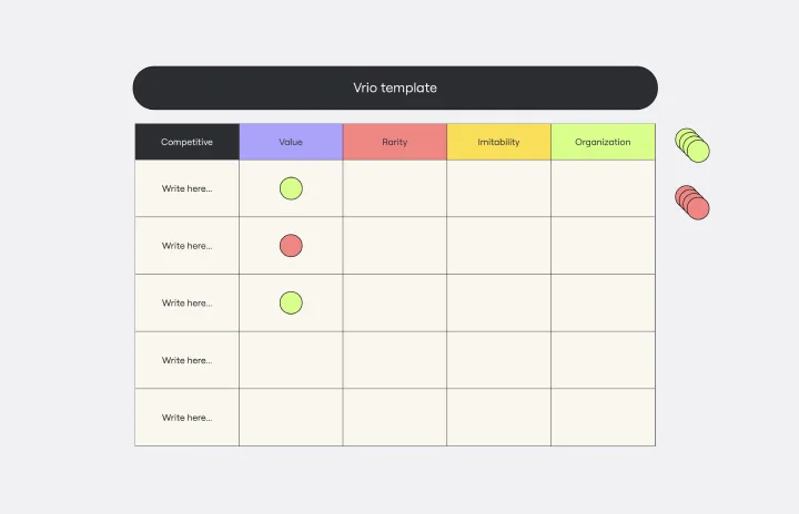
VRIO Analysis Template
Works best for:
Diagramming, Strategy
The VRIO Analysis Template is a framework that helps businesses evaluate their resources and capabilities for competitive advantage. It categorizes resources into four areas: Value, Rarity, Imitability, and Organization. This provides a comprehensive view of an organization's strengths and potential weaknesses. The template has the key benefit of offering quick visual insights. Decision-makers can immediately identify and focus on resources that are valuable, rare, hard to imitate, and well-organized. This ensures a sustainable competitive edge and saves time by avoiding lengthy textual analyses.
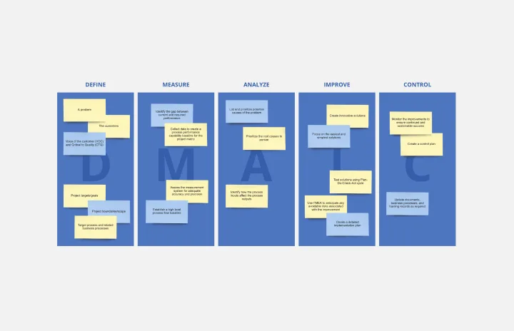
DMAIC Analysis Template
Works best for:
Agile Methodology, Design Thinking, Operations
Processes might not seem like the funnest thing to dive into and examine, but wow can it pay off—a more efficient process can lead to serious cost savings and a better product. That’s what DMAIC analysis does. Developed as part of the Six Sigma initiative, DMAIC is a data-driven quality strategy for streamlining processes and resolving issues. The technique is broken into five fundamental steps that are followed in order: Define, Measure, Analyze, Improve, and Control.
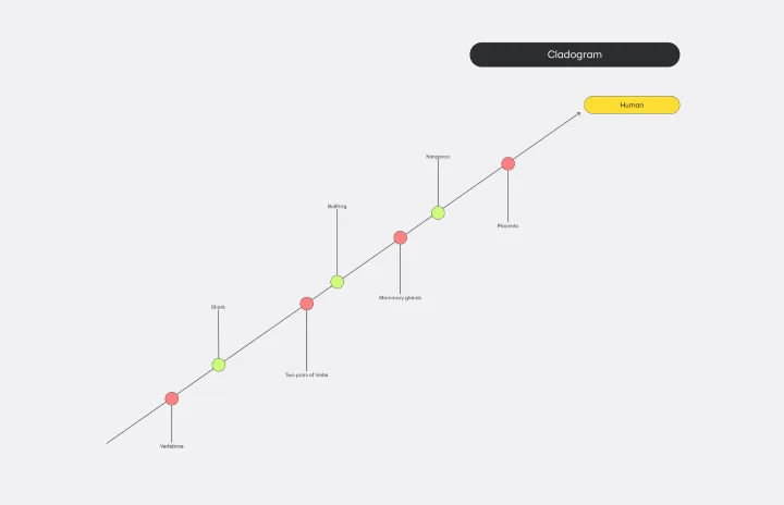
Cladogram Template
Works best for:
Diagramming
The Cladogram Template offers seamless adaptability, empowering users to change, expand, and refine evolutionary representations with ease. Its intuitive interface and automated features ensure dynamic and responsive diagrams that keep up with evolving knowledge. Say goodbye to static diagrams and welcome fluidity and adaptability with Miro's Cladogram Template.
UX Project Canvas Template
Works best for:
User Experience, UX Design, Market Research
Inspired by Alexander Osterwalder's 2005 business model canvas, the project canvas will help your team visualize the big picture of your UX and design projects, providing a convenient structure that holds all of your important data. This innovative tool enables you to transform an idea into a project plan, stimulating collaboration and communication between collaborators. Unlike alternative models, the project canvas is a simple interface. There are few startup costs, and employees can easily be brought up to speed to start using the canvas quickly.