Pyramid Diagram Template
Explain any process where many inputs narrow to a single point with the pyramid template.
About the Pyramid Diagram Template
The pyramid is a profoundly symbolic shape. If you’ve ever heard of a pyramid scheme, the food pyramid, or Maslow’s Hierarchy of Needs, you know what we mean. All of those are examples of a pyramid diagram: an evergreen tool for illustrating hierarchies. Our version of the pyramid template captures that power to help you illustrate important points. A pyramid diagram is a great way to convey hierarchical relationships or processes that build toward an end goal.
What is a pyramid diagram?
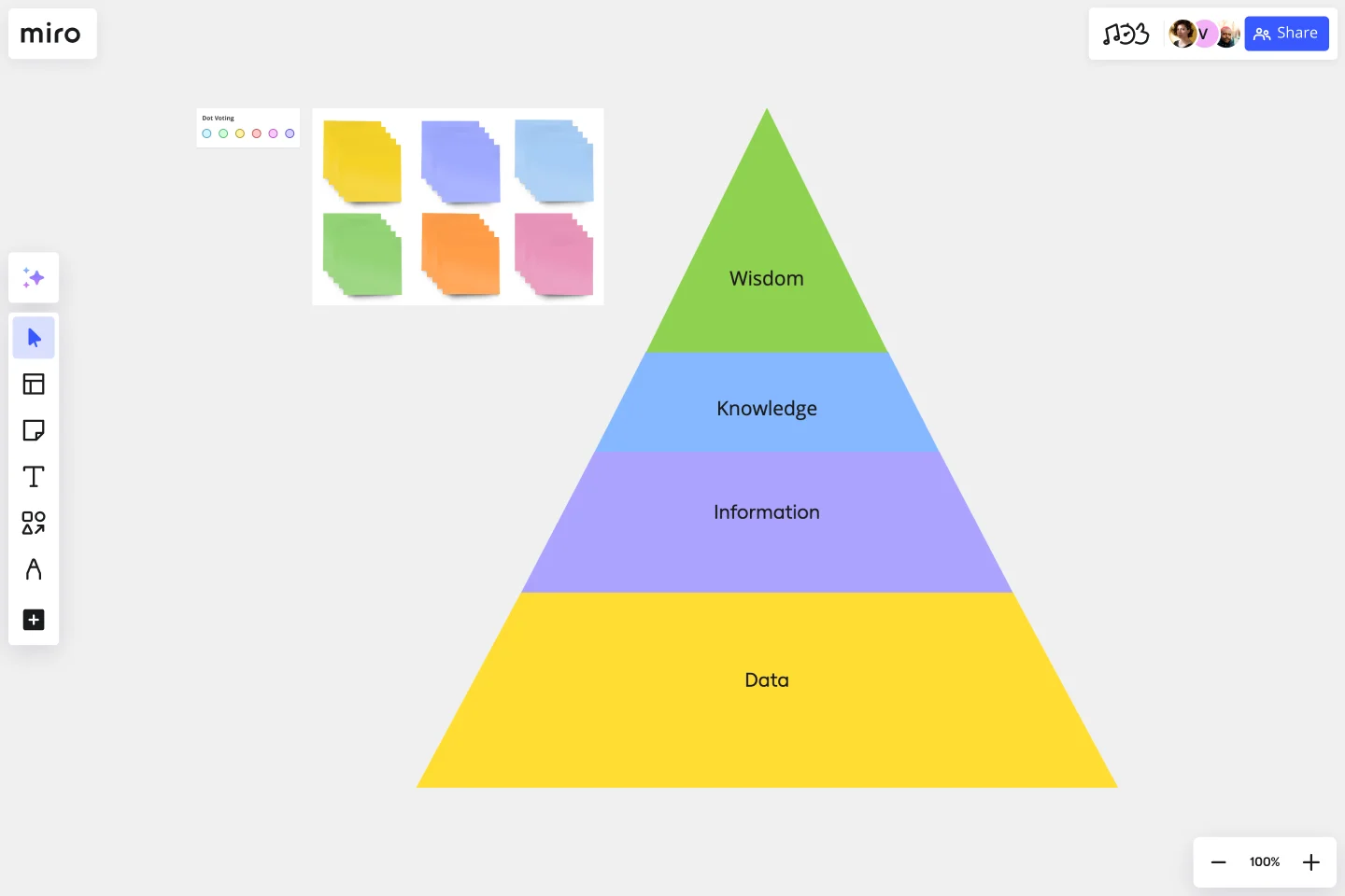
A pyramid diagram, also called a triangle diagram or triangle chart, helps you depict how multiple concepts build on each other in sequence. The sequence can be anything: many inputs narrowing down to a single result, a list of steps one individual must take in order, or the philosophical underpinnings of a well-known concept.
Its format is simple. Take a triangle and divide it into sections with horizontal lines. The pyramid is normally read from the largest segment to the smallest — each section should depend on the sections below it.
How to create your own pyramid chart template
Miro is the perfect graph maker, and with the pyramid template, you can whip up a pyramid diagram with blinding speed.
Start by selecting the pyramid diagram template, then follow these steps:
Step 1: Decide on a topic for your pyramid diagram.
The best topics involve a hierarchical structure, processes that gradually narrow down a field of many inputs or seemingly simple concepts with more complex underlying factors.
Step 2: Pick your stages.
You don’t want your diagram to become too complicated, so try to limit it to a maximum of six stages.
Step 3: Place the stages in order.
Use triangles and trapezoids from our shapes library to create the levels of your pyramid. The pyramid can be upright or inverted, as long as the largest segment corresponds to the broadest concept and the smallest segment to the narrowest.
Step 4: Label and color-code the stages.
Tag each segment with a relevant label. You may want to visually distinguish each stage by giving it a unique color. Rainbow is always fun!
Step 5: Add any additional elements necessary to understand the chart.
For example, you can pull rectangles from the shapes library to post background information beside each pyramid level.
Step 6: Share your pyramid diagram with your team.
Miro lets team members collaborate, working together to create the perfect graph. It works for fully remote or hybrid collaborating teams.
Benefits of using a pyramid template
The biggest benefit of pyramid diagrams is that they’re easy to draw and even easier to understand. When looking at a pyramid, you can usually intuitively grasp what it’s trying to say. One great use of a pyramid diagram is to show how a seemingly simple concept has vast and diverse underpinnings.
For example, a marketing professional could use one to show how their product’s appeal to a certain customer segment is based directly on their customer-centric marketing strategy, their strong UX work, and, finally, on their mission statement.
It’s also an extremely useful template for education.
Common use case of a successful pyramid chart template
The sales funnel is one of the best applications for a pyramid chart. Let’s walk through what that could look like.
The largest segment of a sales funnel pyramid chart could correspond to the stage that involves the largest number of customers. Your potential customer base starts with your total addressable market then narrows to the customers in that market who have heard of your product.
A certain percentage of those customers will research your product after learning about it. A smaller percentage of them will decide that they want one. An even smaller percentage — the smallest segment of the pyramid — will act on that desire and actually buy one.
The diagram could also contain an even smaller segment for the percentage of people who become loyal repeat customers.
How does a pyramid diagram work?
A pyramid diagram organizes several concepts that depend on each other into a hierarchy. The order of the segments corresponds to the sequence of ideas or steps.
How do you make a pyramid graph?
Our Pyramid Diagram template makes it easy. Just grab the shapes you need, label them, and add any background information. It’s perfect for adding color to a presentation.
How do you read a pyramid?
Read from the largest segment to the smallest. That way, you start with the broadest, most basic idea and end at the narrow conclusion. In other words, reason from general to specific.
Is the top of the pyramid the most important?
No, the entire pyramid is important. Every segment should build on the one below and add something to the one above.
Is there a recommended color scheme for a pyramid diagram?
There is no strict rule for color schemes, but it's advisable to use colors that enhance clarity and readability. Consider using a gradient or a color scheme that aligns with your organization's branding.
How can I customize a pyramid diagram template to match my presentation style?
You can adjust the template colors, fonts, and sizes to match your presentation style. Ensure that any customization maintains clarity and doesn't compromise the understanding of the diagram.
Get started with this template right now.
3x3 Prioritization Method Template
Works best for:
Operations, Prioritization, Strategic Planning
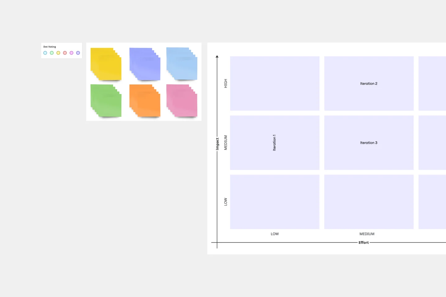
It’s all about assessing a task or idea, and quickly deciding the effort it will take and the potential impact it will have—ranked low, medium, or high. That’s what the 3x3 prioritization method does: Help teams prioritize and identify quick wins, big projects, filler tasks, or time-wasters. With nine bucket areas, it offers slightly greater detail than the 2x2 Prioritization Matrix (or Lean Prioritization Method). It’s easy to make your own 3x3 prioritization matrix—then use it to determine what activities or ideas to focus on with your valuable resources.
Action Plan Template
Works best for:
Education, Project Management, Project Planning, Kanban
Why create an action plan? Long-term business strategies and goals are only good if you can make them a reality—by accomplishing every small task along the way. An action plan lists those tasks and lays them out in clear detail. It helps you keep everything in order, make sure nothing is missed, and get stakeholders on the same page to complete a project quickly and effectively. This template will help you write an action plan that’s SMART: Specific, Measurable, Actionable, Realistic, and Time-bound.
Priority Matrix Template
Works best for:
Business Management, Strategic Planning, Prioritization
If you need a little more than a basic to-do list, then you’d probably benefit from a Priority Matrix. The Priority Matrix template is designed to help you determine which tasks are critical so you can focus on the most urgent needs. In a 2x2 matrix, input your priorities based on whether they must be completed with high or low urgency and are of high or low importance. Applicable to project management and personal management alike, use the Priority Matrix template to improve business processes, create efficiency, remove blockers, and reduce operational waste.
What's on Your Radar Template
Works best for:
Business Management, Operations, Strategic Planning
Do you or your team feel overburdened by tasks? Having trouble focusing on particular problems? What’s on Your Radar is a thought exercise in which you plot ideas according to their importance or relevance. Designers and teams use what’s on your radar to ensure that their ideas are within the scope of a given project. They also rely on the method to assess whether a given solution is likely to solve the problem at hand. But even if you’re not a designer, the method can help assign priorities and ground your ideas in reality.
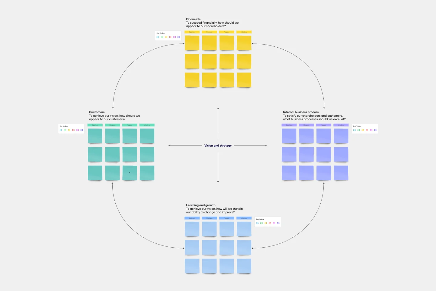
Balanced Scorecard Template
Works best for:
Operations, Strategic Planning, Project Planning
Balanced scorecards are useful tools for understanding business performance at a glance with regard to customers, employees, business processes, and financial progress. Learn more about BSCs and create your own using Miro’s Balanced Scorecard template.
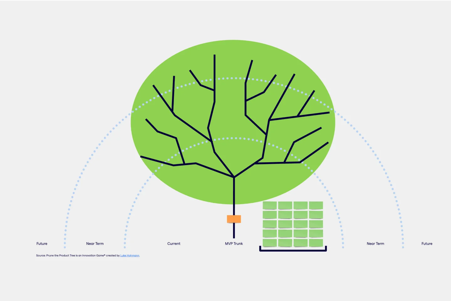
Prune the Product Tree Template
Works best for:
Design, Desk Research, Product Management
Prune the Product Tree (also known as the product tree game or the product tree prioritization framework) is a visual tool that helps product managers organize and prioritize product feature requests. The tree represents a product roadmap and helps your team think about how to grow and shape your product or service by gamifying feedback-gathering from customers and stakeholders. A typical product tree has four symbolic features: the trunk, which represents the existing product features your team is building; the branches, each of which represents a product or system function; roots, which are technical requirements or infrastructure; and leaves, which are new ideas for product features.