Pie Chart Template
Present relationships between datasets and see contrast right away with the pie chart template.
Trusted by 65M+ users and leading companies


About the Pie Chart Template
A pie chart template shows the relationships between datasets, illustrated within a circle. It’s often also referred to as a circle chart. The circle sections look like slices of a pie and represent different datasets so that you can easily compare them all at once. The Pie Chart Template is an excellent tool to enhance presentations and make data more digestible to any audience.
What is the pie chart template
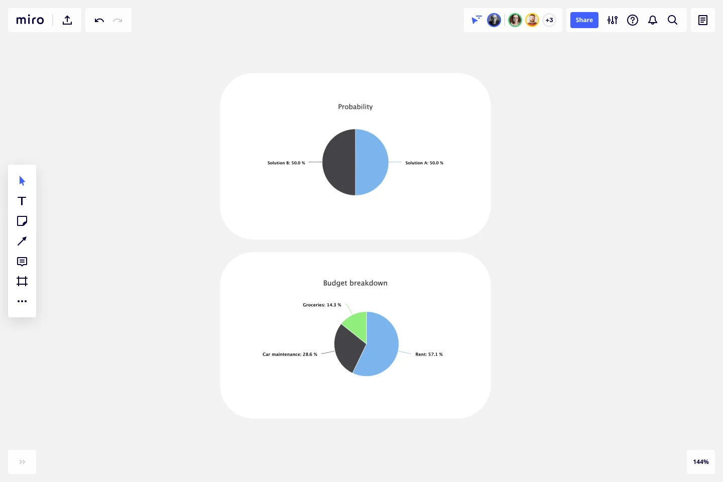
The pie chart template is a circle with sections, representing the pie ‘slices’, with the arc’s length being proportional to the quantity represented. The sections making up the pie chart, often displayed in percentages, are equal to 100% when added up, making a full circle.
When to use the pie chart template
Professionals across many industries use pie charts to compare data and show contrasts. It’s one of the most used diagrams since it can be easily read and interpreted.
Business organizations and the educational sector use pie charts and other graphs to support storytelling with visual data, and engage audiences easily and more quickly.
How to create a pie chart
You can easily make a pie chart in Miro, either using our ready-made template or drawing one from scratch. Miro’s extensive diagramming capabilities make it the perfect pie chart maker, where you can, with just a few clicks, create your own pie chart.
How to make a pie chart using our ready-made template:
Select the pie chart template.
Double-click the pie chart to add data to each series. Make sure to add real numbers and not percentages.
Edit title and legend.
After you set your pie chart, you can edit how it looks and change the colors as you like.
How to create a custom pie chart:
Click ‘charts’ on the toolbar.
Select the object, in this case, the pie chart.
Double click the pie chart. A pop-up window will show.
Add your data.
In Miro, you can edit the values of your pie chart, and the colors will be selected automatically.
A pie chart example
Let’s say you want to save on your water consumption. To analyze how much water you are using, you can create a pie chart to show all the ways you consume water and how much water each of them uses. You can add toilet consumption, shower, kitchen sink, washing machine, dishwasher, and any leakages. For each of these, add the percentage of their consumption.
As you can see, the total consumption should be 100%, which will configure your whole pie chart.
With this pie chart, you can see right away which one has the most significant share of consumption and which one has the lowest.
Where can I create a pie chart?
People often create a pie chart to visually show data when doing presentations or delivering reports. Miro is an excellent pie chart maker, where you can easily create your pie chart and attach it to any other document by either downloading or embedding your pie chart template board. Highly customizable, our pie chart template is also easily shareable so you and your team can add ideas and make communication flow easier with it. Try it for yourself and see if that works for you.
Get started with this template right now.
DMAIC Analysis Template
Works best for:
Agile Methodology, Design Thinking, Operations
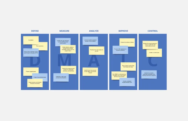
Processes might not seem like the funnest thing to dive into and examine, but wow can it pay off—a more efficient process can lead to serious cost savings and a better product. That’s what DMAIC analysis does. Developed as part of the Six Sigma initiative, DMAIC is a data-driven quality strategy for streamlining processes and resolving issues. The technique is broken into five fundamental steps that are followed in order: Define, Measure, Analyze, Improve, and Control.
Cause and Effect Diagram Template
Works best for:
Diagramming
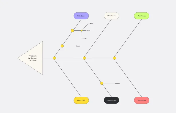
The Cause and Effect Diagram Template is a useful tool for analyzing complex relationships, identifying root causes of problems, and improving organizational processes. It can be customized to fit user's unique needs and provides a structured framework for analysis. Teams can use real-time collaborative analysis on the Miro platform to drive continuous improvement initiatives.
Job Search Process Diagram
Works best for:
Diagramming
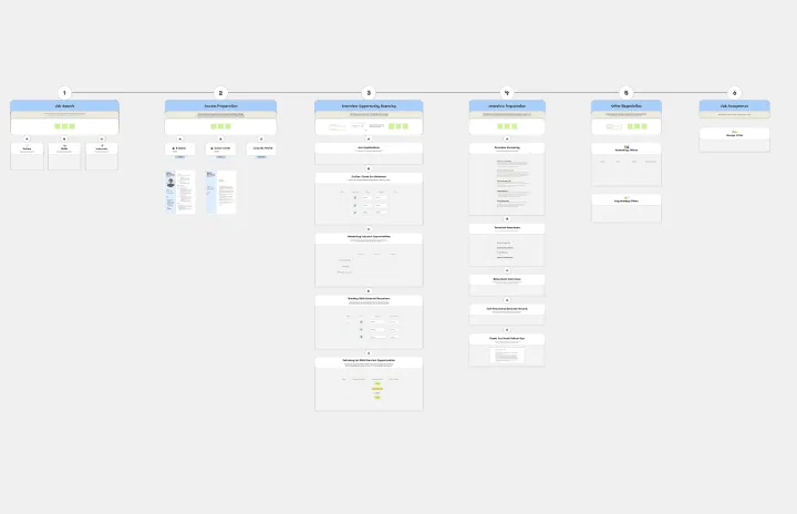
The Job Search Process Diagram template offers a visual tool for mapping out the steps and stages involved in the job search process. It provides a structured framework for organizing tasks, tracking progress, and managing resources. This template enables job seekers to streamline their job search efforts, stay organized, and increase their chances of success. By promoting clarity and efficiency, the Job Search Process Diagram empowers individuals to navigate the job market effectively and achieve their career goals.
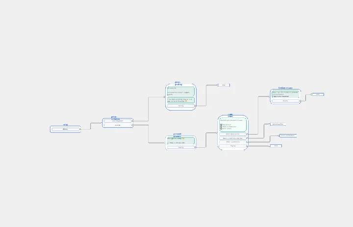
Chat-Bot
Works best for:
Diagramming
The Chat Bot template is a visual tool for designing and mapping out chatbot interactions and functionalities. It provides a structured framework for visualizing conversation flows, user inputs, and bot responses. This template enables teams to collaborate on designing chatbot experiences that are intuitive and user-friendly, driving engagement and satisfaction. By promoting clarity and alignment, the Chat-Bot template empowers organizations to create effective chatbot solutions that meet user needs and business objectives.
Family Tree Template
Works best for:
Education, Mapping
Family trees help you make sense of complicated family relationships, even generations back. With this Family Tree Template, you can quickly and easily add your siblings, parents, and extended family members. Plus, add extra information, notes, and even images to create a vibrant family tree.
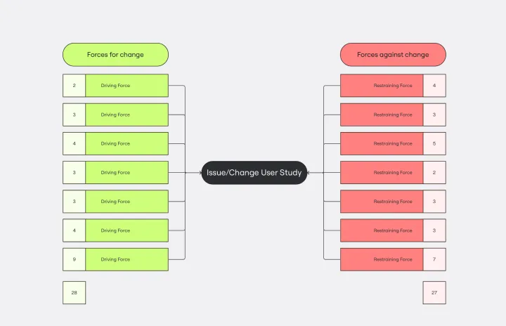
Force Field Analysis Template
Works best for:
Diagramming, Strategic Planning
A Force Field Analysis Template is a powerful tool that helps teams identify and analyze the forces supporting or hindering progress toward a specific change or goal. This template provides a visual space where you can brainstorm and plot out 'driving forces' that push objectives forward and 'restraining forces' that prevent advancement, all on a single, intuitive board. One of the primary benefits of utilizing the Force Field Analysis template is that it fosters a shared understanding among team members. By visually mapping out and discussing each force, teams can prioritize efforts, build consensus on the central issues to tackle, and collaboratively devise strategic plans to strengthen positive influences while reducing negative ones.