Pie Chart Template
Present relationships between datasets and see contrast right away with the pie chart template.
About the Pie Chart Template
A pie chart template shows the relationships between datasets, illustrated within a circle. It’s often also referred to as a circle chart. The circle sections look like slices of a pie and represent different datasets so that you can easily compare them all at once. The Pie Chart Template is an excellent tool to enhance presentations and make data more digestible to any audience.
What is the pie chart template
The pie chart template is a circle with sections, representing the pie ‘slices’, with the arc’s length being proportional to the quantity represented. The sections making up the pie chart, often displayed in percentages, are equal to 100% when added up, making a full circle.
When to use the pie chart template
Professionals across many industries use pie charts to compare data and show contrasts. It’s one of the most used diagrams since it can be easily read and interpreted.
Business organizations and the educational sector use pie charts and other graphs to support storytelling with visual data, and engage audiences easily and more quickly.
How to create a pie chart
You can easily make a pie chart in Miro, either using our ready-made template or drawing one from scratch. Miro’s extensive diagramming capabilities make it the perfect pie chart maker, where you can, with just a few clicks, create your own pie chart.
How to make a pie chart using our ready-made template:
Select the pie chart template.
Double-click the pie chart to add data to each series. Make sure to add real numbers and not percentages.
Edit title and legend.
After you set your pie chart, you can edit how it looks and change the colors as you like.
How to create a custom pie chart:
Click ‘charts’ on the toolbar.
Select the object, in this case, the pie chart.
Double click the pie chart. A pop-up window will show.
Add your data.
In Miro, you can edit the values of your pie chart, and the colors will be selected automatically.
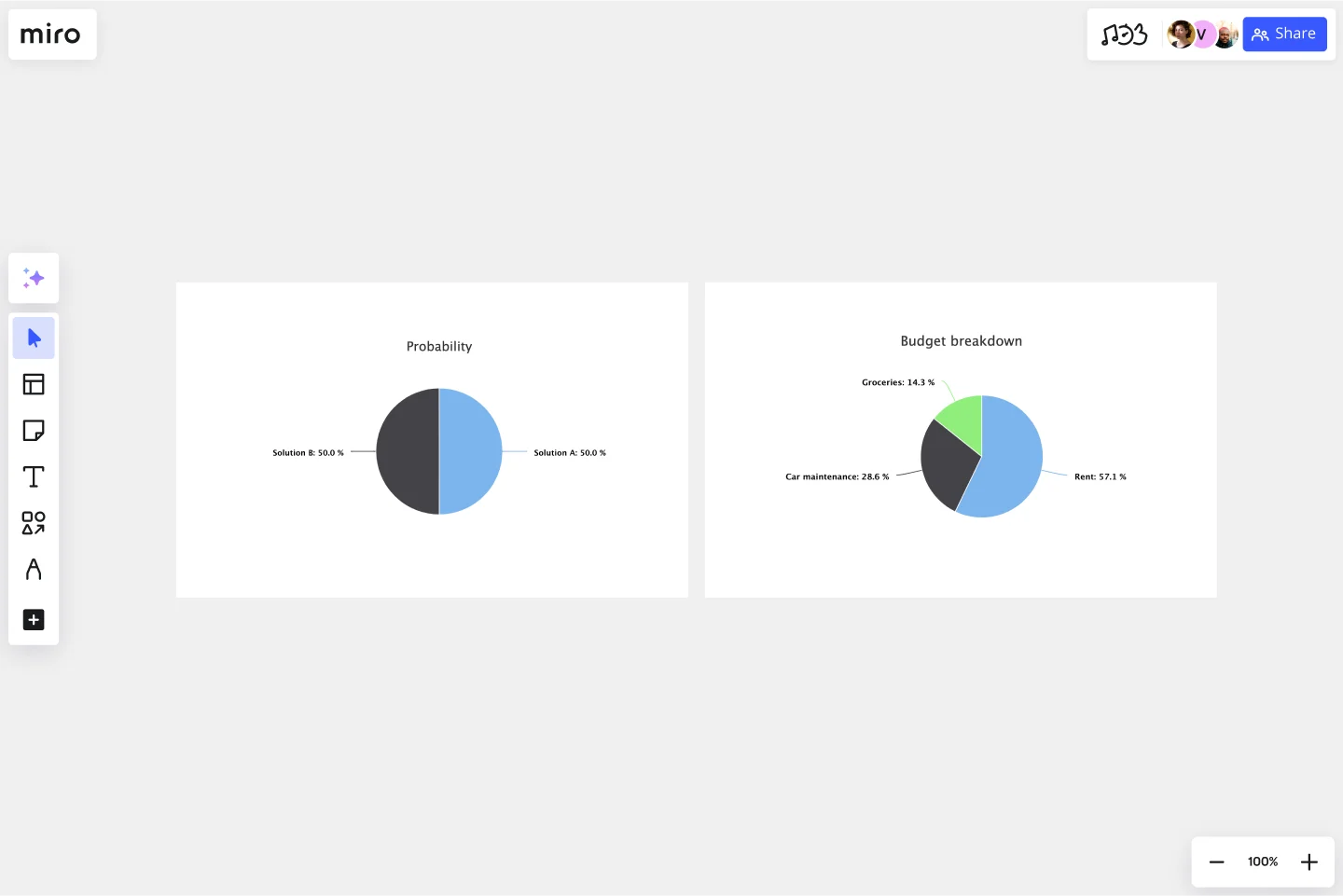
A pie chart example
Let’s say you want to save on your water consumption. To analyze how much water you are using, you can create a pie chart to show all the ways you consume water and how much water each of them uses. You can add toilet consumption, shower, kitchen sink, washing machine, dishwasher, and any leakages. For each of these, add the percentage of their consumption.
As you can see, the total consumption should be 100%, which will configure your whole pie chart.
With this pie chart, you can see right away which one has the most significant share of consumption and which one has the lowest.
Where can I create a pie chart?
People often create a pie chart to visually show data when doing presentations or delivering reports. Miro is an excellent pie chart maker, where you can easily create your pie chart and attach it to any other document by either downloading or embedding your pie chart template board. Highly customizable, our pie chart template is also easily shareable so you and your team can add ideas and make communication flow easier with it. Try it for yourself and see if that works for you.
Get started with this template right now.
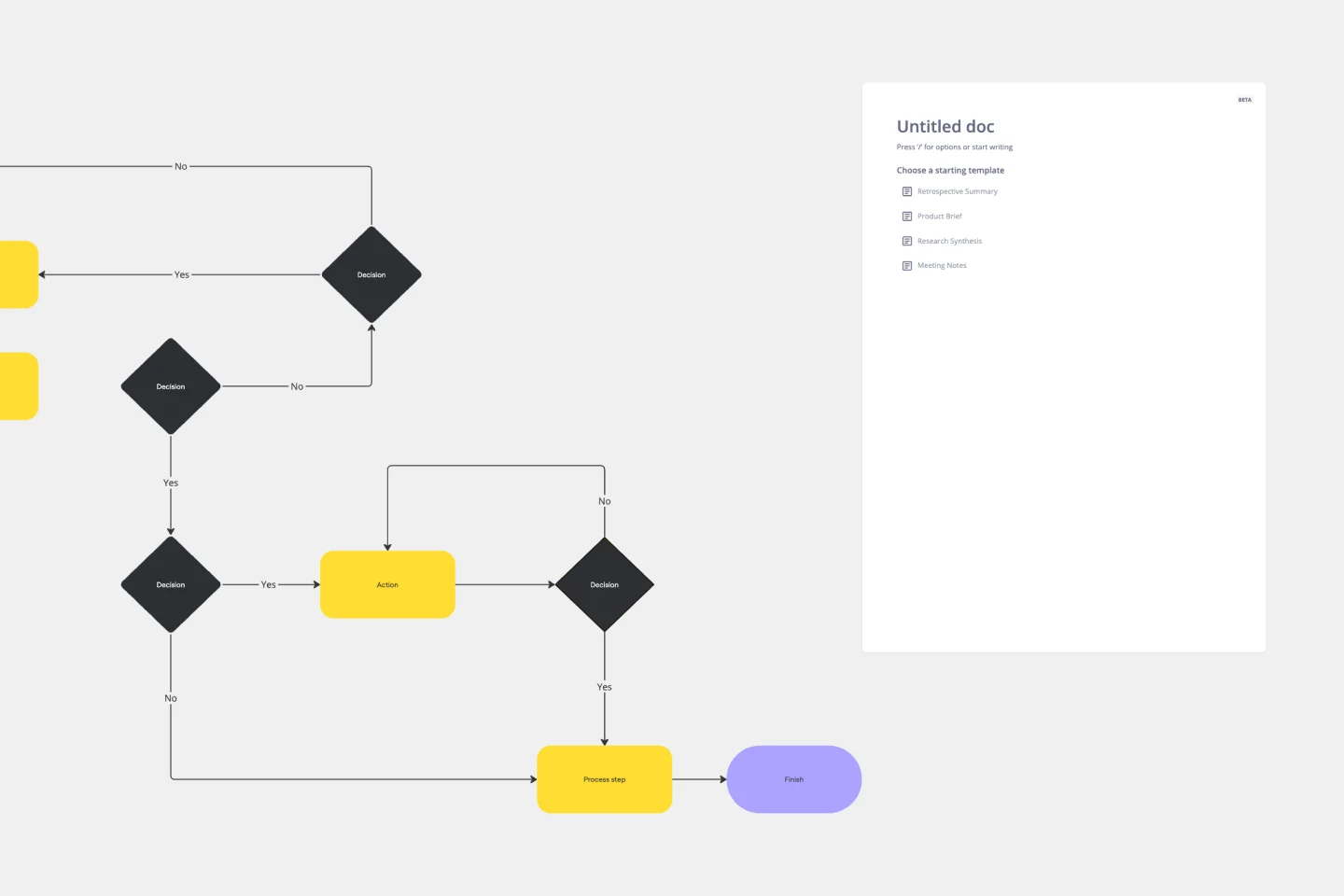
Production Flowchart Template
Works best for:
Flowcharts
The Production Flowchart Template is a well-crafted tool that clearly represents a production process from start to finish. It breaks down complex procedures into easy-to-understand segments, making it easier for stakeholders to grasp the entire process. One of the key benefits of using this template is that it helps to clarify complex production pathways. By mapping out operations visually, teams can identify potential bottlenecks or inefficiencies, facilitating timely and well-informed decision-making.
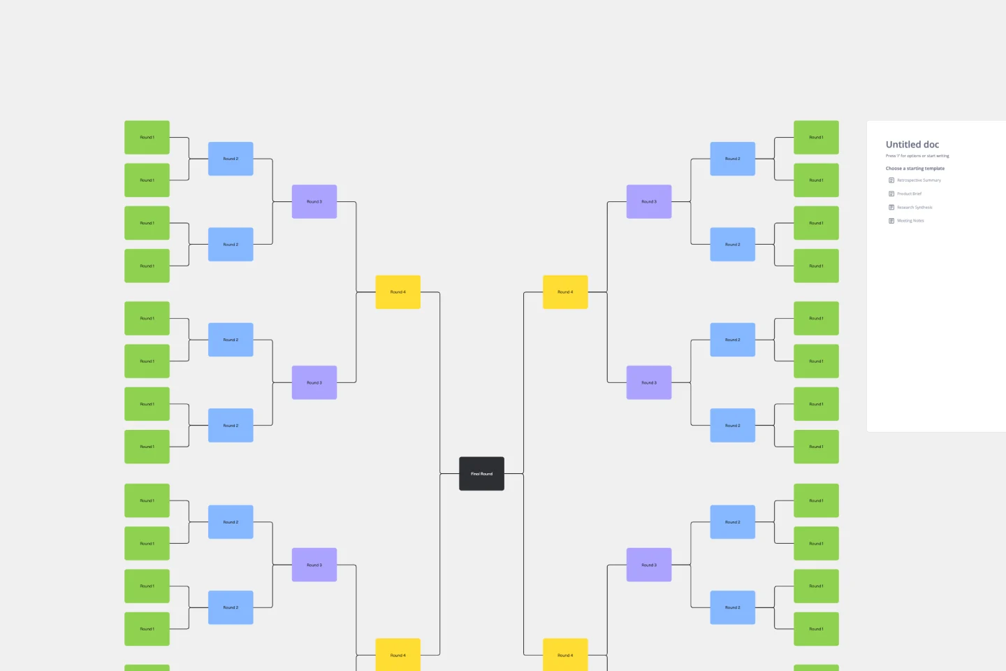
Bracket Template
Works best for:
Diagramming
The Bracket Template is a dynamic visualization tool that helps to organize and rank ideas, entities, or teams in a sequential and competitive manner. It is structured like a tree, starting with multiple entries on either side, which then face off in successive rounds, leading to a single winner or conclusion. One of its standout benefits is its ability to simplify complex decision-making processes. Breaking down choices into smaller, head-to-head comparisons, makes the path to a final decision clearer, ensuring clarity and fostering engagement among participants. Moreover, the Bracket Template is particularly useful when there are multiple options to consider and when there is a need to compare and contrast those options. It is an effective way to streamline decision-making, making it easier and more efficient.
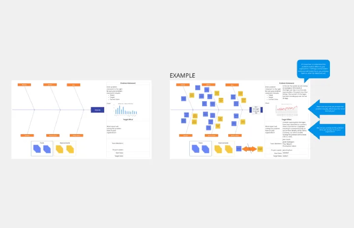
Crowd Sourced Cause and Effect
Works best for:
Fishbone Diagram, Problem solving
The Crowd Sourced Cause and Effect template leverages collective intelligence to identify root causes of problems. By involving multiple team members, you can gather diverse perspectives and uncover insights that might be overlooked. This collaborative approach ensures a comprehensive analysis and fosters team engagement.
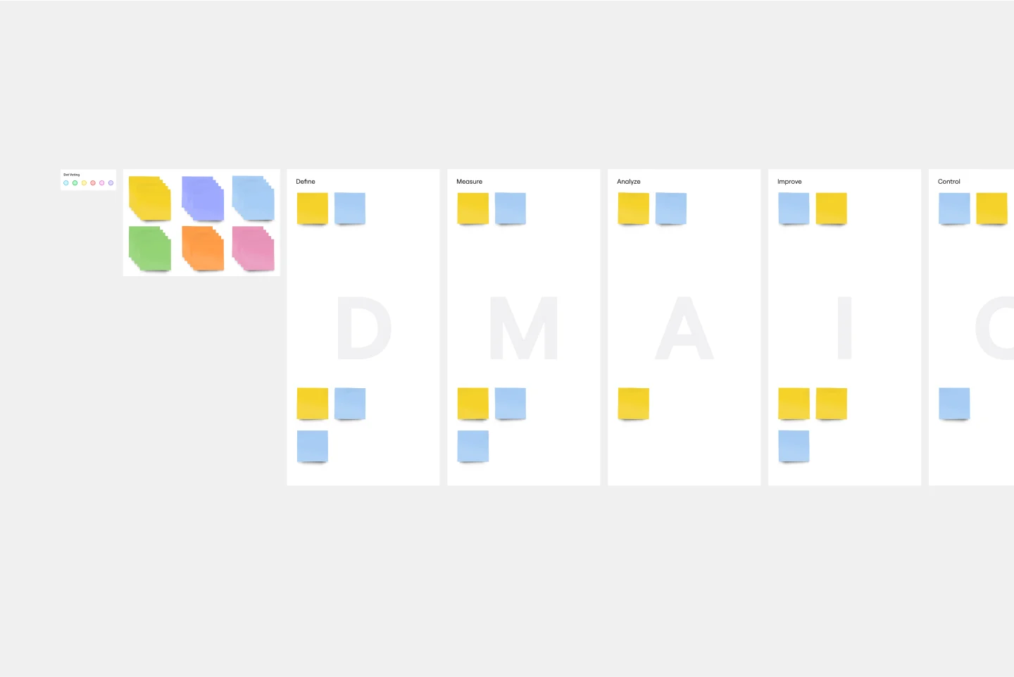
DMAIC Analysis Template
Works best for:
Agile Methodology, Design Thinking, Operations
Processes might not seem like the funnest thing to dive into and examine, but wow can it pay off—a more efficient process can lead to serious cost savings and a better product. That’s what DMAIC analysis does. Developed as part of the Six Sigma initiative, DMAIC is a data-driven quality strategy for streamlining processes and resolving issues. The technique is broken into five fundamental steps that are followed in order: Define, Measure, Analyze, Improve, and Control.
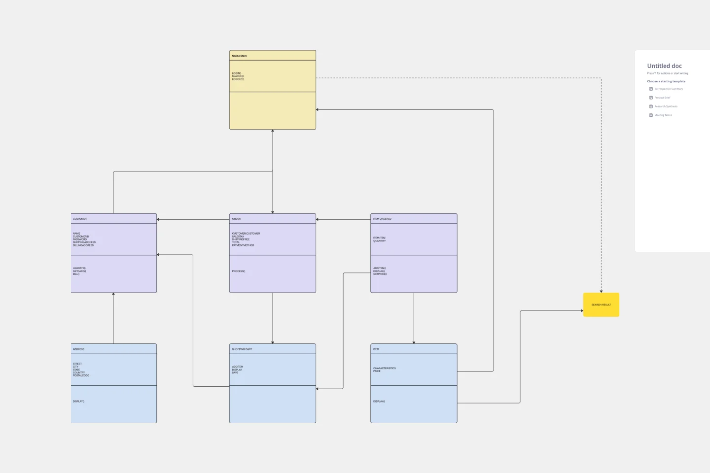
UML Diagram Template
Works best for:
Diagrams, Software Development
Originally used as a modeling language in software engineering, UML has become a popular approach to application structures and documenting software. UML stands for Unified Modeling Language, and you can use it to model business processes and workflows. Like flowcharts, UML diagrams can provide your organization with a standardized method of mapping out step-by-step processes. They allow your team to easily view the relationships between systems and tasks. UML diagrams are an effective tool that can help you bring new employees up to speed, create documentation, organize your workplace and team, and streamline your projects.
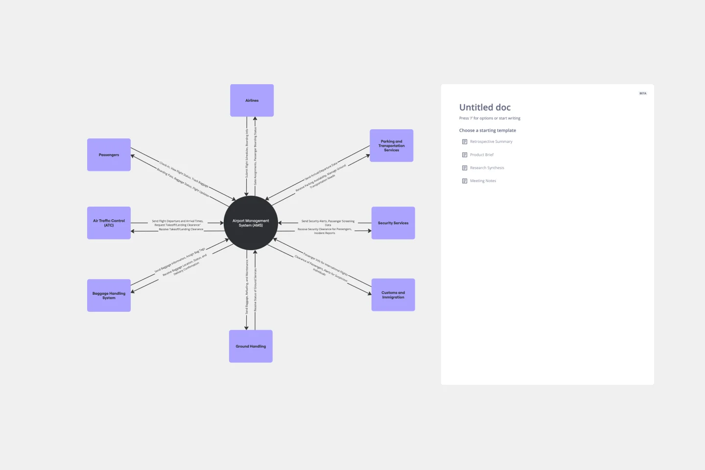
Context Diagram Template
Works best for:
Business Management, Mapping, Diagrams
A context diagram is a perfect tool to view an entire system as a single process and understand how external factors interact with it. These external factors can include customers, developers, management, and more. The Context Diagram Template is your tool for creating this diagram.