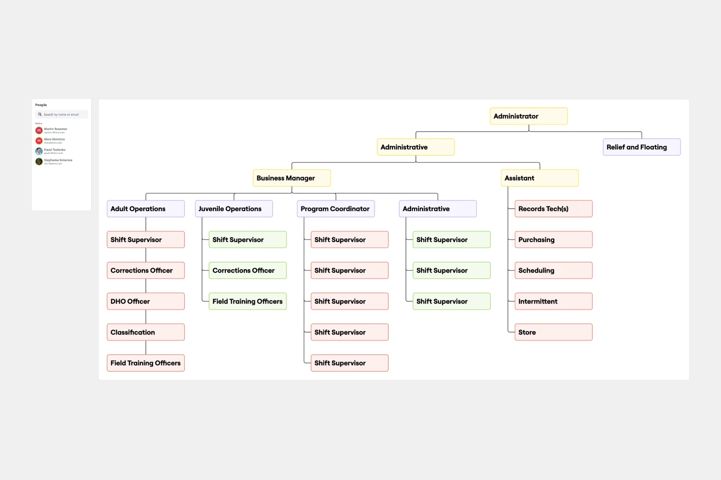
Inverted Org Chart Template
Bring an innovative approach to organizational design with the inverted org chart template. Reimagine the traditional hierarchies and place the frontline employees at the top of your organizational structure.
About the Inverted Org Chart Template
The structure of organizations is constantly changing. The traditional hierarchical arrangement where executives are at the top and frontline employees at the bottom is no longer the norm. Instead, we have the Inverted Org Chart Template.
This new and innovative tool prioritizes frontline employees in visualizing organizational structure. This template flips the traditional pyramid, giving prominence to those closest to the customers, products, or services. The layout includes areas for frontline employees, mid-level management, senior leadership, and executive roles, among others. Miro's org chart maker is designed to be intuitive, allowing stakeholders to quickly understand the structure and identify where each role fits within the inverted hierarchy.
How to use the inverted org chart template
Edit with ease: By double-clicking shapes, adjust the template to your liking. Whether renaming positions, adding new roles, or reshuffling the structure, the template is designed for simplicity and efficiency.
Expand as needed: The automated diagramming features make it a breeze to expand the template. Add more shapes for new roles or departments, and connector lines automatically adjust to maintain a coherent visual.
Add contextual artifacts: Enhance the chart's clarity and relevance by adding any artifact—be it notes, images, links, or documents. The template seamlessly integrates with other tools, allowing you to provide richer context and deeper insights.
Why should you use an inverted org chart template?
Employee-centric Vision: The chart places frontline employees at the top, emphasizing the importance of those who directly interact with customers and creating a culture of appreciation and recognition.
Improved transparency: This layout provides a clear view of the company's structure, making it easier for everyone to understand the chain of command and reporting relationships.
Encourages feedback loop: With frontline employees in a prominent position, it promotes a feedback-driven environment where insights from the ground can quickly ascend the hierarchy, fostering communication and collaboration.
Adaptable to change: The template's design is flexible, allowing for swift modifications as the organization evolves, grows, or restructures.
Enhances communication: By visualizing the flow of communication in an inverted manner, teams can better understand how information should flow and ensure effective cross-departmental collaboration.
Is the inverted org chart suitable for all industries?
Yes, the Inverted Org Chart is adaptable and can be tailored to suit any industry, emphasizing the roles and responsibilities most crucial to that particular sector.
How many levels can I add to the chart?
The template is designed for scalability. You can add as many levels as necessary to represent your organization's structure accurately.
Can I integrate other tools with this template?
Absolutely! The template is designed to seamlessly integrate with other tools, allowing you to add notes, images, links, or documents for richer context.
What if my organization follows a traditional hierarchy?
While the Inverted Org Chart prioritizes frontline employees, it can be easily adapted to represent traditional hierarchies. The key is to use its features to depict your organizational structure best.
Get started with this template right now.
Causal Loop Diagrams (1.0)
Works best for:
Diagramming
The Causal Loop Diagrams (1.0) template offers a visual tool for modeling complex systems and understanding the feedback loops that drive behavior. It provides a structured framework for identifying causal relationships, reinforcing loops, and balancing feedback within a system. This template enables teams to analyze system dynamics, anticipate unintended consequences, and formulate effective strategies for intervention. By promoting systems thinking and understanding of interdependencies, Causal Loop Diagrams empower organizations to navigate complexity and drive sustainable change.
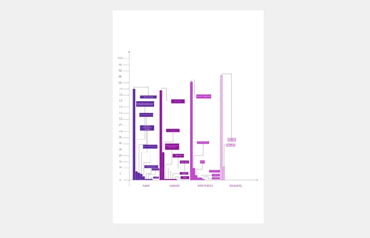
Bar Chart / Diagram Combined
Works best for:
Diagramming
The Bar Chart / Diagram Combined template offers a versatile tool for creating visualizations that combine bar charts with other diagrammatic elements. It provides elements for representing data trends, relationships, and comparisons effectively. This template enables teams to create customized visualizations that communicate complex information in a clear and compelling manner. By promoting visual clarity and insight, the Bar Chart / Diagram Combined template empowers teams to make data-driven decisions and communicate findings with impact.
Chain of Command Template
Works best for:
Organizational design, Org chart
The Chain of Command Template represents an organization's hierarchical structure, paving the way for enhanced clarity in roles and responsibilities. One of its standout benefits is the promotion of efficient communication. By clearly delineating the channels of authority and the reporting structure, team members can effortlessly identify the right people to approach with specific queries, concerns, or updates. This streamlined communication fosters better team collaboration and ensures that pivotal information reaches its intended destination promptly, driving overall organizational efficiency.
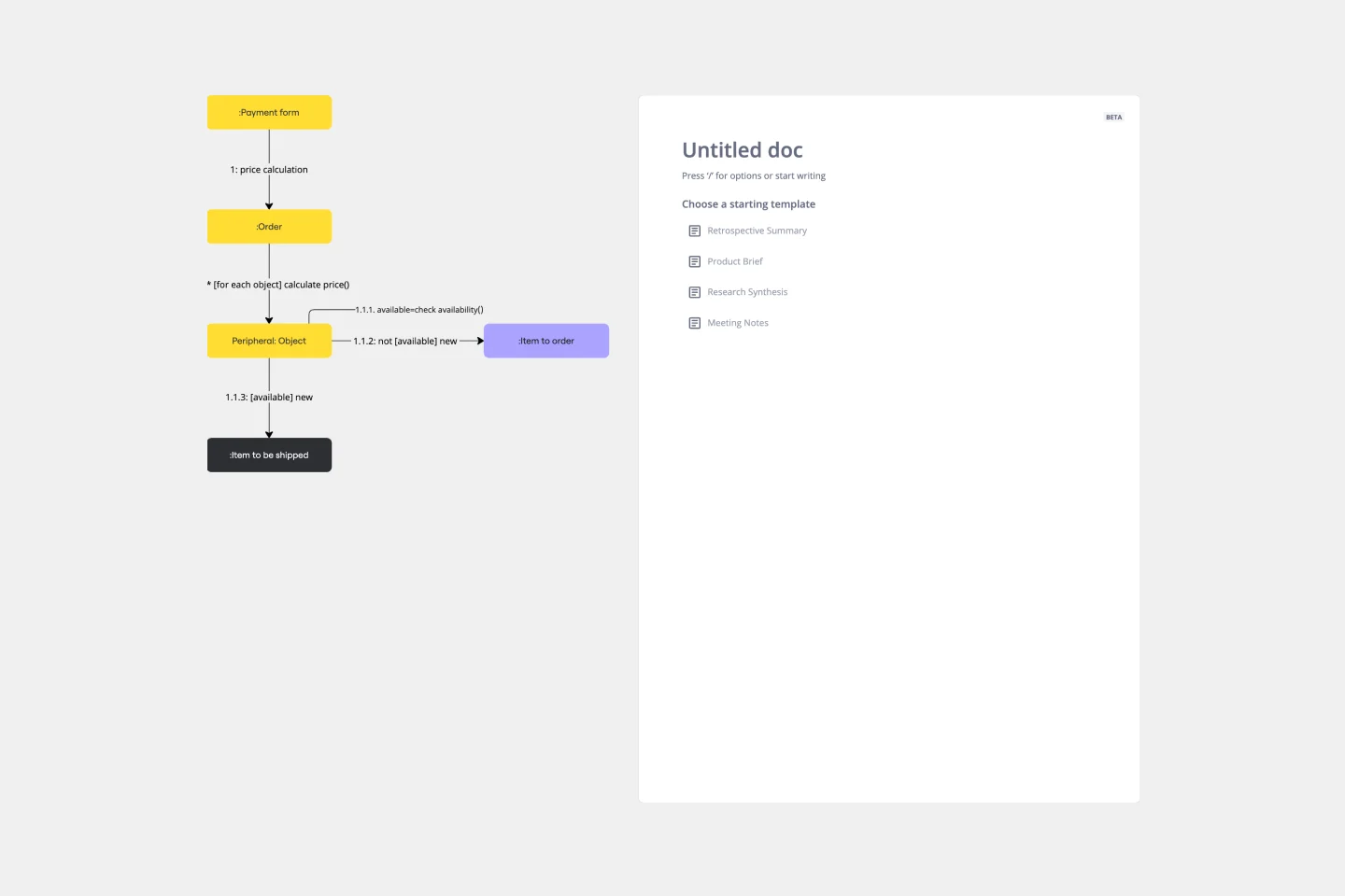
UML Communication Diagram Template
Works best for:
Software Development, Mapping, Diagrams
Most modern programs consist of many moving parts working to a precise set of instructions. With a communication diagram, you can visualize exactly how those parts work together, giving you a clearer understanding of your program as a whole. What’s more, the diagram leaves spaces for expanding the network of relationships as your product grows and evolves. A communication diagram is a vital tool in any software designer’s arsenal.
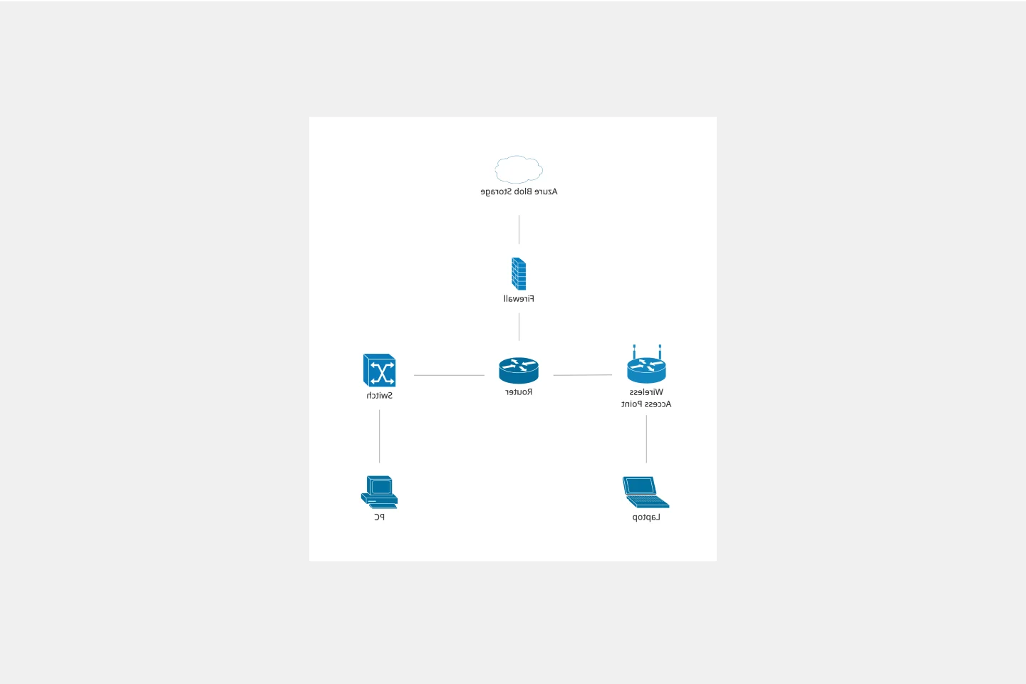
Cisco Network Diagram Template
Works best for:
Software Development, Diagrams
Cisco offers data center and access networking solutions built for scale with industry-leading automation, programmability, and real-time visibility. The Cisco Data Network Diagram uses Cisco elements to show the network design of Cisco Data Networks visually.
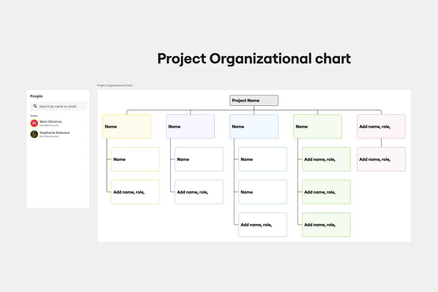
Project Organizational Chart Template
Works best for:
Project Management, Documentation, Org Charts
When you’re embarking on a long, complex project, you will inevitably hit roadblocks and obstacles. It’s important to have your project organizational chart on hand to overcome those challenges. A project organizational chart is a visual diagram that illustrates who is on your team and the role they play in a given project. It documents the structure of the project organization, the hierarchy between team members, and the relationships between employees. Project organizational charts are useful tools for clarifying who does what, securing buy-in, and setting expectations for the group.