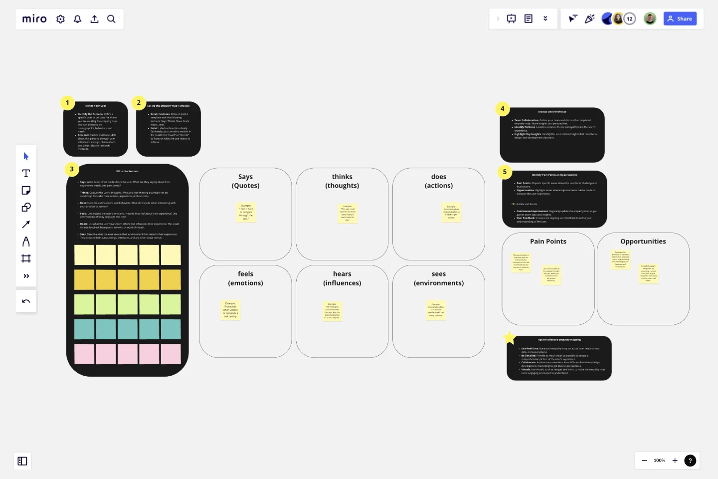
Empathy Map for User Experience
The Empathy Map for User Experience template is a strategic tool designed to help teams deeply understand their users by capturing and visualizing their thoughts, feelings, behaviors, and perceptions.
This comprehensive template facilitates a user-centered design approach, ensuring that products and services are tailored to meet real user needs and preferences.
Sections of the Template
Says: Captures direct quotes and statements from the user about their experience.
Thinks: Encompasses the user's internal thoughts and reflections.
Does: Observes and notes the user's actions and behaviors.
Feels: Identifies the emotional responses and feelings of the user.
Hears: Records what the user hears from others that influences their experience.
Sees: Describes the user's environment and visual context.
Why Use This Template?
User-Centric Insights:
Benefit: Helps teams focus on the user’s perspective, leading to more relevant and user-friendly designs.
Outcome: Products and services that better meet user needs and expectations, enhancing overall satisfaction.
Improved Collaboration:
Benefit: Encourages cross-functional team collaboration by providing a shared understanding of the user.
Outcome: More cohesive and integrated design and development efforts, reducing silos and fostering innovation.
Identifying Pain Points and Opportunities:
Benefit: Enables teams to pinpoint specific user challenges and areas for improvement.
Outcome: Targeted enhancements that address user pain points, improving usability and experience.
Actionable Insights:
Benefit: Translates qualitative data into clear, actionable insights that can drive design decisions.
Outcome: More informed and effective design strategies that are aligned with user needs.
Visual and Intuitive:
Benefit: The visual format makes it easy to understand and communicate user insights.
Outcome: Simplified and effective communication among team members and stakeholders, facilitating better decision-making.
The Empathy Map for User Experience template is an essential tool for any team looking to create user-centered products and services. By leveraging this template, teams can gain a deeper understanding of their users, foster better collaboration, and drive more effective and impactful design decisions.
This template was created by Anthony.
Get started with this template right now.
UML Sequence E-commerce Checkout Template
Works best for:
UML
The UML Sequence E-commerce Checkout Template in Miro is a versatile tool for visualizing and analyzing e-commerce checkout processes. It provides a step-by-step visual representation of system interactions, is highly customizable, supports real-time collaboration, and is suitable for various e-commerce platforms. It serves as an efficient documentation tool, fosters team collaboration, and contributes to a more streamlined checkout experience for customers.
Goals-based Roadmap
Works best for:
Roadmap, Planning, Mapping
The Goals-based Roadmap template enables teams to set clear objectives and chart a course for achieving them. By defining specific goals and milestones, teams can track progress and adapt their strategies accordingly. This template fosters accountability and transparency, ensuring that everyone is working towards common objectives. With a focus on outcomes, teams can prioritize initiatives that drive the greatest impact and value.
Strategic Action Framework
Works best for:
Roadmap, Planning, Mapping
The Strategic Action Framework template provides a structured approach for developing and implementing strategic initiatives. By defining goals, strategies, and action plans, teams can align their efforts with organizational objectives and drive progress towards desired outcomes. This template fosters collaboration and accountability, ensuring that strategic initiatives are executed effectively and deliver measurable results.
UML Sequence Rental Booking System Template
Works best for:
UML
The UML Sequence Rental Booking System Template streamlines the process of documenting and visualizing the interactions within a car rental booking system. This template maps out the communication flow between the customer, user interface, payment service, and vehicle allocation system, ensuring a smooth and efficient workflow. By providing a clear visual representation of these interactions, the template helps in improving understanding among team members and stakeholders, promoting efficient design and collaboration.
UML Sequence Registration Process Template
Works best for:
UML
The UML Sequence Registration Process Template helps visualize and document user registration processes. It enables the rapid creation of sequence diagrams, which are crucial for enhancing clarity and identifying potential issues early in the design phase. This template not only supports collaborative efforts through Miro's platform, facilitating real-time teamwork, but also ensures a comprehensive system design. Being part of a broader collection of UML diagram templates, it stands as a valuable asset for projects involving registration workflows, contributing to streamlined project execution and effective communication among team members.
Detailed Empathy Map With Personas
Works best for:
Empathy Map
Understand your audience better with the Empathy Map Personas template. This tool helps you capture insights into your customers' needs, thoughts, feelings, and behaviors. By visualizing these personas, you can tailor your product development, marketing strategies, and customer interactions to better meet their needs and enhance user satisfaction. Ideal for teams focused on customer-centric solutions.
