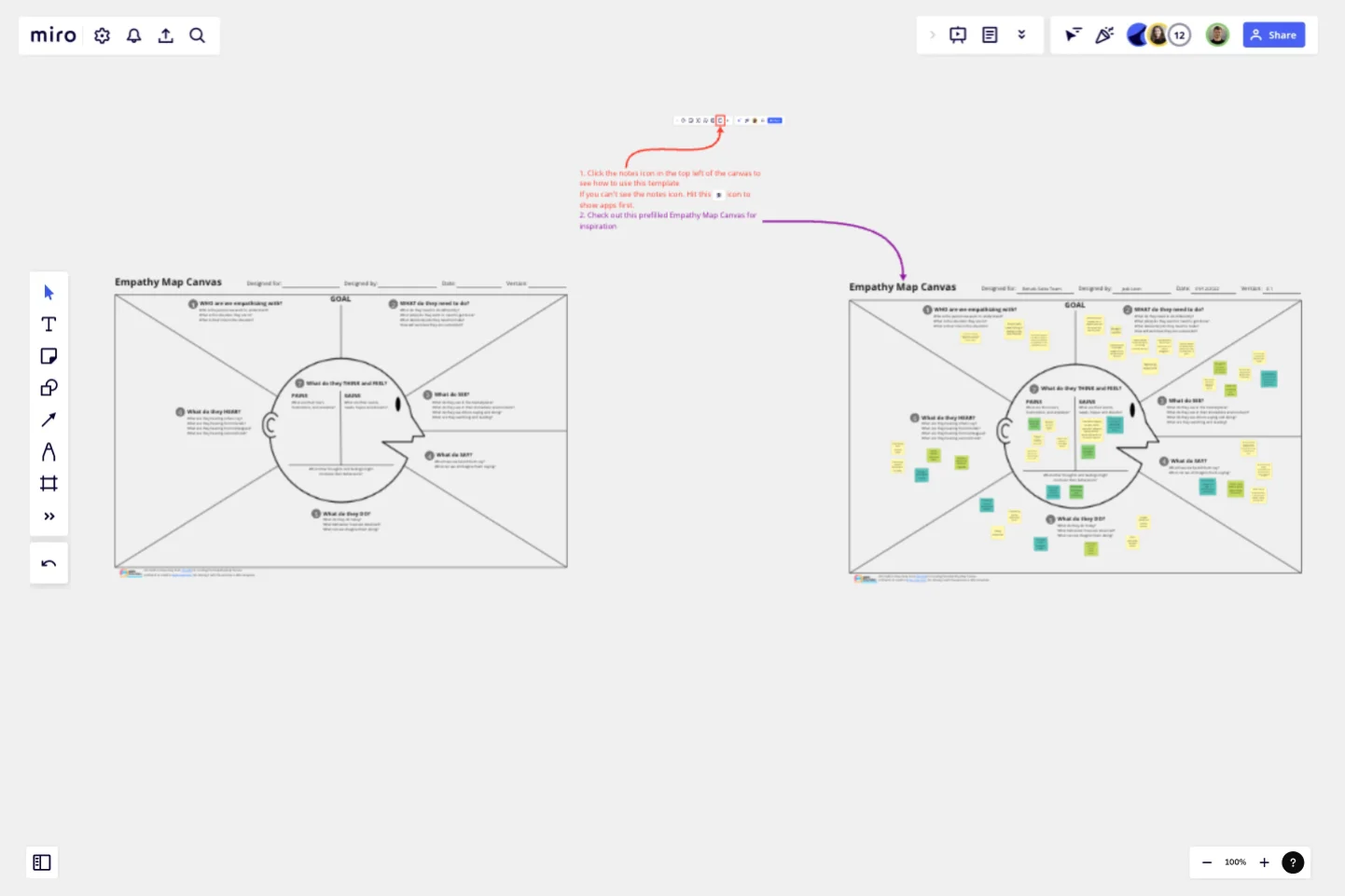
Empathy Map Canvas by Jack León
The empathy map, developed by Dave Gray, founder of XPLANE, takes user personas to a whole new level. It puts you in the shoes of your users.
How to use the Empathy Map Canvas
This is best done in a collaborative environment with a cross-functional team and a variety of backgrounds. Frankly, it can be a little tiresome to do on your own, and you're likely to cut corners as a result 🙂 Ideally this exercise is facilitated by someone who has experience running workshops.
Step 1. The Goal
The Goal consists of 2 parts, numbered 1 and 2 on the canvas.Number 1, the description of a person representing your user, their role, and the specific situation that you are interested in helping with.Number 2, what they're trying to do. This is could be a part of a job, or a decision they need to make. It is important to articulate what success looks like for your user.This part is normally led by a Product Owner or a UX lead or analyst.Make sure everyone understands who the user is, what the user is trying to do, and the context within which the behavior is being performed.
Step 2. Around the Head
Now go around the outside of “The Big Head” following the numbers from 3 through to 6. Everyone grabs a bunch of sticky notes and joins in, trying to imagine the world from the user’s perspective.Everyone should spend around 5 minutes on each area; SEE, SAY, DO and HEAR. A great way to run this part of the exercise is using the working together alone technique. Everyone is given time to come up with their own ideas, followed by a quick tidy-up. The tidy-up phase is optional and might consist of a quick deduplication, a brief discussion if any notes are not clear, and sorting of the notes if relevant. Do this for each section from 2 to 6.
Step 3. Inside the Head
Now we are going inside the head of our user. Before you do, the facilitator should take 5 minutes to quickly summarise all the sticky notes in sections 1 through to 6. This will give everyone time to internalize and expand their empathy for the user.Section 7 has 3 areas, Pains, Gains, and others. As the canvas states, Pains are things that are worrying our user, Gains are things our user wants and others is an area to put notes which are hard to classify but feel important.Again, have the team work together alone, giving everyone 8-10 minutes on section 7. After that, the facilitator will optionally organize the sticky notes by deduplicating and sorting if required.
Conclusion
The exercise is now over, and the facilitator might decide to summarise and request clarification where notes are not clear.The Empathy Map Canvas is an indispensable part of Design Thinking, along with Persona Design and User Journey Mapping. Using these artifacts to shape proposition design ensures the team is developing customer-centric solutions.
This template was created by Jack León.
Get started with this template right now.
Remote Design Sprint Template
Works best for:
Design, Desk Research, Sprint Planning
A design sprint is an intensive process of designing, iterating, and testing a prototype over a 4 or 5 day period. Design sprints are conducted to break out of stal, work processes, find a fresh perspective, identify problems in a unique way, and rapidly develop solutions. Developed by Google, design sprints were created to enable teams to align on a specific problem, generate multiple solutions, create and test prototypes, and get feedback from users in a short period of time. This template was originally created by JustMad, a business-driven design consultancy, and has been leveraged by distributed teams worldwide.
Research Topic Brainstorm Template
Works best for:
Desk Research, Brainstorming, Ideation
Coming up with a topic for a research project can be a daunting task. Use the Research Topic Brainstorm template to take a general idea and transform it into something concrete. With the Research Topic Brainstorm template, you can compile a list of general ideas that interest you and then break them into component parts. You can then turn those parts into questions that might be the focus for a research project.
Storyboard for Animation Template
Works best for:
Storyboard
The Storyboard for Animation template offers a structured approach to visualizing your animation from start to finish. With sections for scenes, actions, audio, and technical details, this template supports every stage of animation production. Perfect for animators and creatives, it enhances collaboration, ensures consistency, and brings your animated vision to life with clarity and precision.
Empathy Map by Axelle Vanquaillie
Works best for:
Market Research, Research & Design
Empathy Mapping template is a valuable tool for gaining deep insights into user experiences. It helps you understand their motivations and challenges, ensuring your products address real needs. Ideal for UX researchers and designers.
Design Sprint Template
Works best for:
Desk Research, Sprint Planning, UX Design
Solve big challenges, create new products or improve existing ones with this Design Sprint Template. Build better products with innovative and faster processes.
Remote Design Sprint Template
Works best for:
Design, Desk Research, Sprint Planning
A design sprint is an intensive process of designing, iterating, and testing a prototype over a 4 or 5 day period. Design sprints are conducted to break out of stal, work processes, find a fresh perspective, identify problems in a unique way, and rapidly develop solutions. Developed by Google, design sprints were created to enable teams to align on a specific problem, generate multiple solutions, create and test prototypes, and get feedback from users in a short period of time. This template was originally created by JustMad, a business-driven design consultancy, and has been leveraged by distributed teams worldwide.
