Data Flow Diagram Template
Model processes and map data flows efficiently with the data flow diagram template. Improve internal processes and lead development teams with more clarity.
Available on Enterprise, Business, Education plans.
About the Data Flow Diagram Template
The data flow diagram template is a visual tool you can use to improve your understanding of how data travels within a system — namely by visualizing the inputs, outputs, and the processes involved. Organizations use data flow diagrams (DFD) in many business activities, including depicting notation styles, physical requirements, and system automation.
We’ll walk you through how you can start creating a data flow diagram using Miro’s free and customizable DFD template.
How to use Miro’s data flow diagram template
To get started with Miro’s data flow diagram template, scroll to the top of this page and click on the blue “use template” button. That’ll open the template and allow you to start using Miro’s diagram maker. Once you’ve opened it, think about what type of system you’re trying to visualize — whether it’s a business process, data flow within a software application, or something else. When you’re ready, here are a few more steps to make the most of the data flow diagram template.
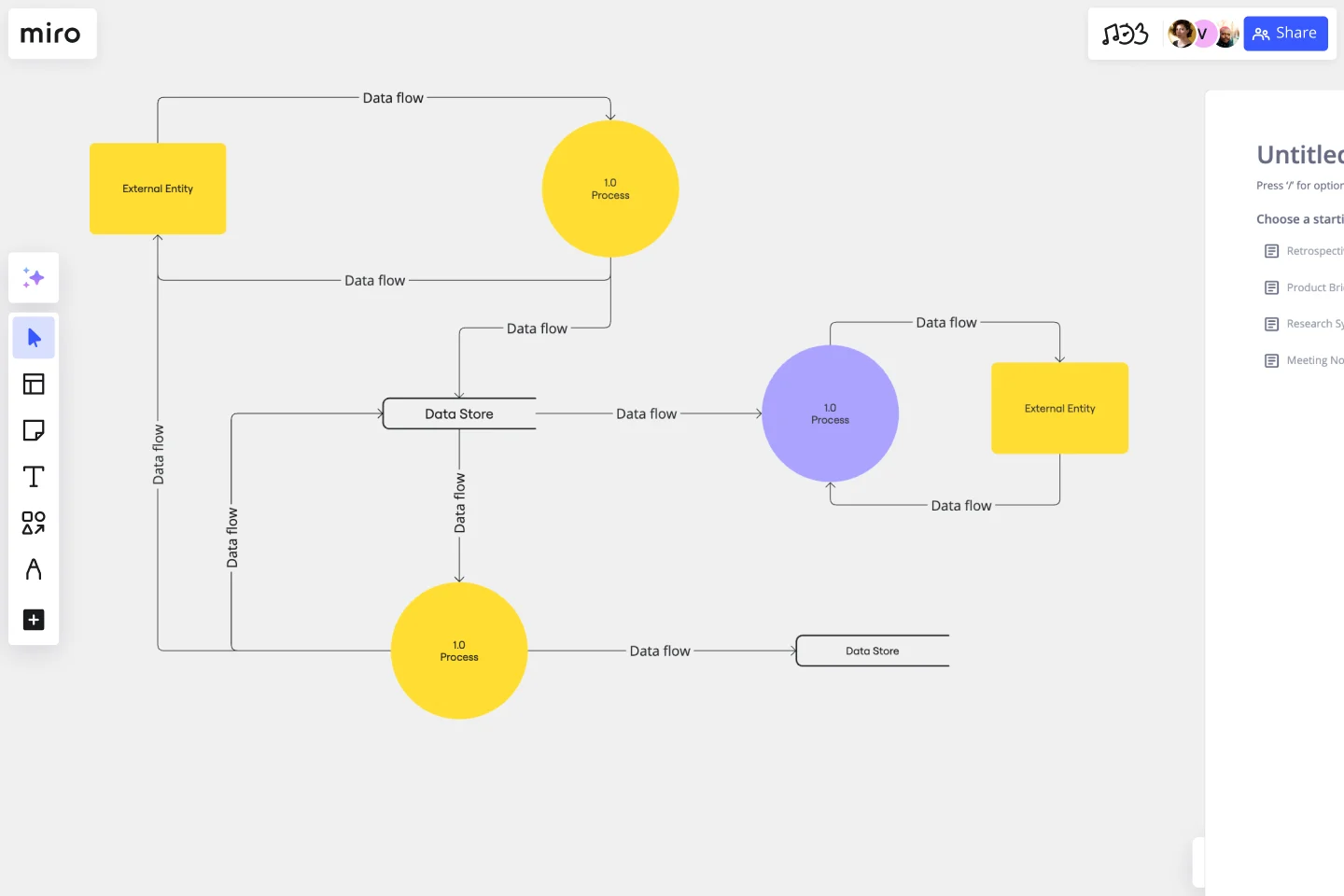
1. Identify inputs and outputs
Each process you aim to map out should have at least one input and one output. This helps make sure that your DFD template is complete and has no loose ends. Look for the two blue, rounded rectangles on the left and right of the DFD template marked “external entity,” then edit the text boxes within them to label where the data is entering the system from and where it’ll go. To add more input and output sources, right-click on the rectangle and choose “Duplicate.”
2. Identify processes
On the data flow diagram template, the three circles labeled “Process” are for you to identify the activities or functions that manipulate data in some way. Edit the text boxes to add your system’s processes, and easily delete or duplicate these circles as needed.
3. Identify data stores
There are two symbols on the template labeled “data store.” As its name implies, it refers to where the system stores its data. Double-click on the text boxes to edit them and replace the text with how you want to label your data stores. Duplicate these symbols as needed, and click and drag them if you’d like to adjust their position on the diagram.
4. Label data flows
Last but not least, don’t forget to visualize the flow of data. The template comes with arrows connecting inputs, outputs, processes, and data stores. Edit the text along these arrows to identify the type of data that’s traveling, and click and drag them to adjust the direction of flow appropriately.
Is Miro’s data flow diagram template free?
Yes, Miro’s data flow diagram template is free and fully customizable, so you can make it your own. Just click on the blue “use template” button on this page to get started.
Who is Miro’s data flow diagram template for?
Miro’s data flow diagram template is for any team involved in system development, analysis, optimization, and collaboration — including data analysts, software development teams, growth teams, and product teams.
What’s the difference between a data flow diagram and a flowchart?
A data flow diagram is your guide to understanding the nitty-gritty of how information travels within a system — such as databases, software applications, and business processes. While a flowchart also visualizes flows, it isn’t limited to representing data. Flowcharts are versatile maps that outline processes, decisions, and actions much more broadly. Miro's free data flow diagram template is specially crafted to visualize the intricacies of data flow within complex systems.
Get started with this template right now. Available on Enterprise, Business, Education plans.
Prototype Template
Works best for:
UX Design, Design Thinking
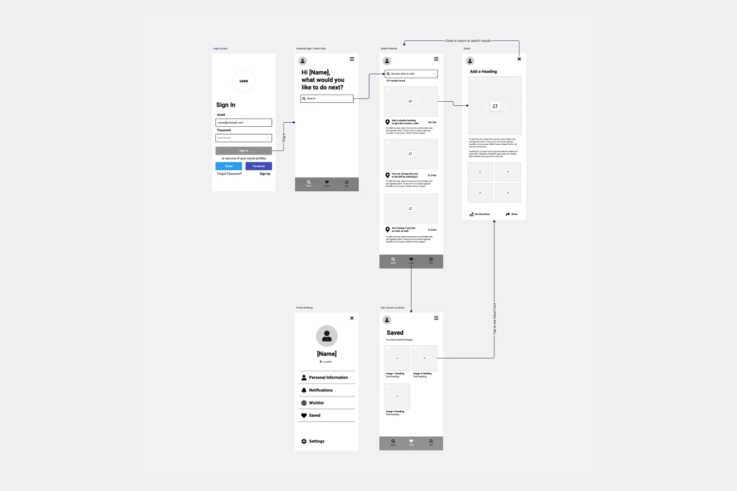
A prototype is a live mockup of your product that defines the product’s structure, user flow, and navigational details (such as buttons and menus) without committing to final details like visual design. Prototyping allows you to simulate how a user might experience your product or service, map out user contexts and task flows, create scenarios to understand personas, and collect feedback on your product. Using a prototype helps you save money by locating roadblocks early in the process. Prototypes can vary, but they generally contain a series of screens or artboards connected by arrows or links.
Fishbone Diagram by Hanna Havulinna
Works best for:
Diagramming
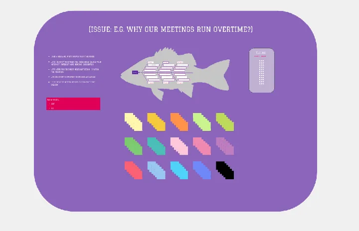
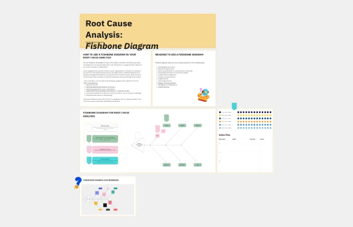
The Fishbone Diagram template, also known as the Ishikawa or Cause-and-Effect diagram, offers a visual tool for identifying and analyzing root causes of problems or issues. It provides a structured framework for categorizing potential causes into major categories such as people, process, environment, and equipment. This template enables teams to conduct root cause analysis systematically, facilitating problem-solving and decision-making. By promoting a structured approach to problem analysis, the Fishbone Diagram empowers teams to address issues effectively and implement corrective actions efficiently.
Fishbone RCA
Works best for:
Problem solving, Strategy
Use the Fishbone RCA template to conduct a thorough root cause analysis (RCA) for any problem. This template helps you break down complex issues into manageable categories, enabling you to identify the underlying causes. It's an effective tool for improving processes, solving problems, and preventing future issues.
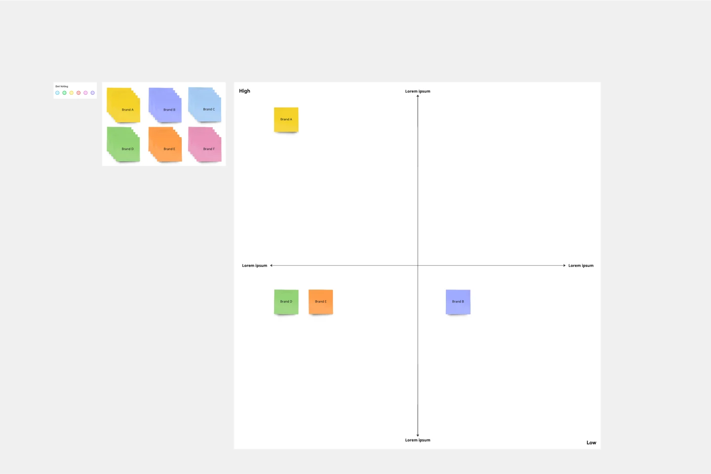
Strategic Group Mapping Template
Works best for:
Mapping, Strategy
The Strategic Group Mapping Template is a cutting-edge visual tool designed to translate the competitive landscape of their industry. By allowing users to plot entities based on distinct criteria, this template provides an at-a-glance view of market dynamics. One standout benefit of using this tool is its ability to identify clusters of competitors and market gaps, paving the way for businesses to strategically position themselves for optimal success.

Multiple-Product Roadmap
Works best for:
Planning, Mapping
The Multiple Product Roadmap template empowers product managers to visualize and manage multiple product initiatives effectively. By providing a centralized view of project timelines, dependencies, and milestones, this template fosters alignment and transparency across teams. With sections for prioritizing initiatives, tracking progress, and communicating updates, it enables teams to coordinate efforts and drive collective success. This template serves as a strategic tool for planning and executing product roadmaps that align with organizational goals and drive business growth.
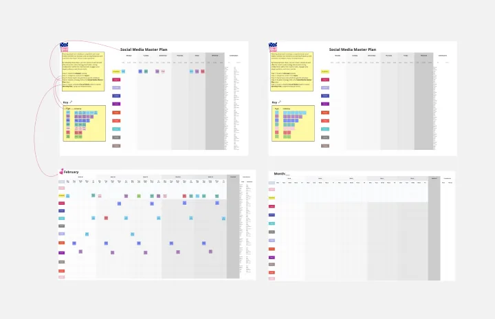
Social Media Strategy Planning
Works best for:
Roadmap, Planning, Mapping
The Social Media Strategy Planning template provides a structured approach for developing and implementing social media strategies. By defining objectives, target audiences, and content plans, teams can maximize the impact of their social media efforts. This template fosters collaboration and alignment across teams, ensuring that social media initiatives are integrated with broader marketing goals and contribute to overall business objectives.