Bull's Eye Diagram Template
Make better decisions by sorting items into a priority matrix. Improve productivity and ensure your team meet’s its deadlines using a bull’s eye chart.
About the Bull’s Eye Diagram Template
When making a decision, teams sometimes struggle to adjudicate between priorities. This is especially true for high-stakes decisions, where every task on your to-do list feels like it could make or break a project. The inability to prioritize tasks can lead to gridlock among team members, inefficient meetings, and even low morale.
What is a bull’s eye diagram?
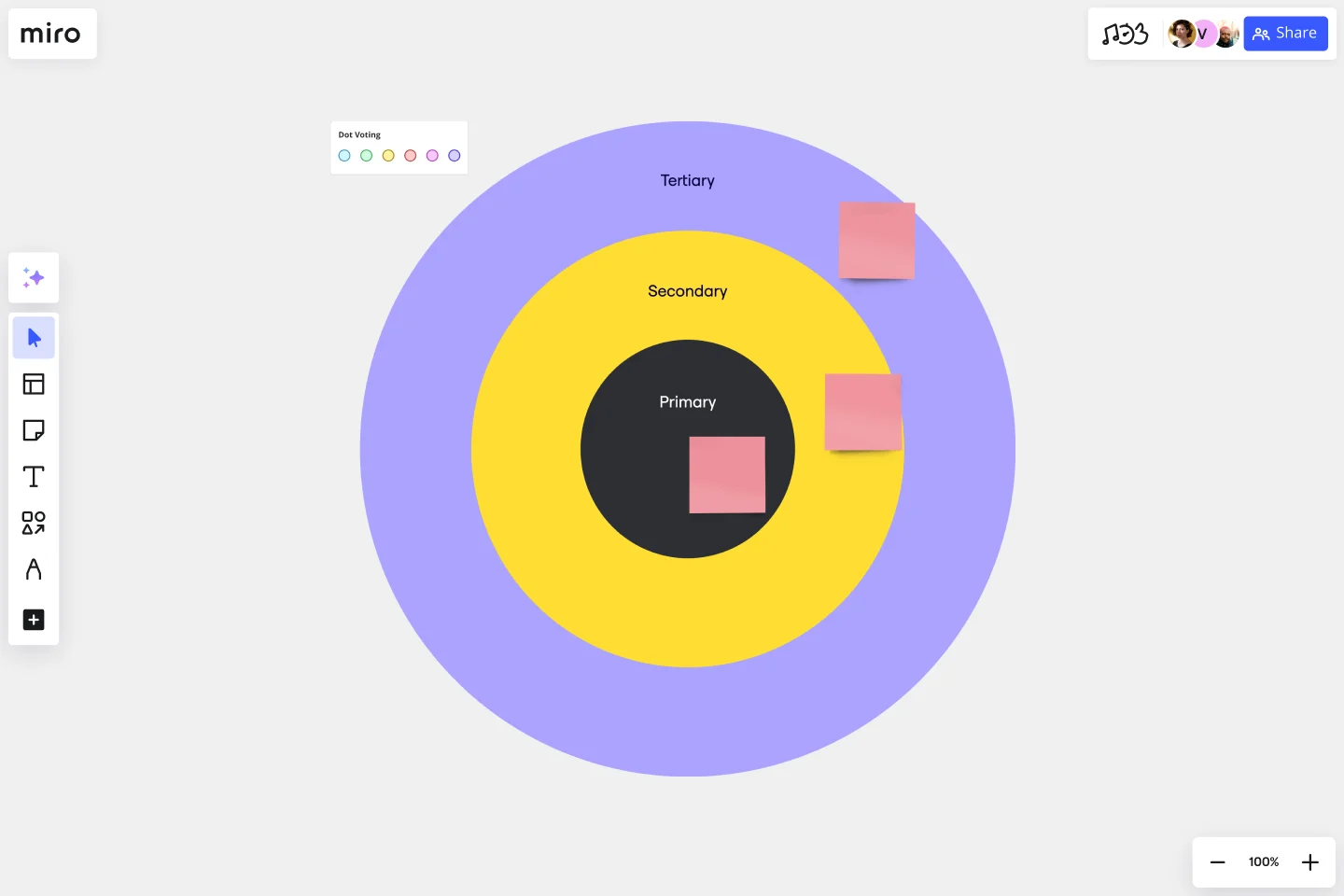
A bull’s eye diagram is a simple tool that enables teams to clarify priorities before making a decision. As the name suggests, the chart is set up to look like a bull’s eye. The innermost circle contains the highest-priority items, the middle circle contains medium-priority items, and the largest circle contains the lowest-priority items.
The beauty of the bull’s eye diagram is that it eliminates any possibility of gridlock. Teams struggle to make decisions and build momentum when every task on your list seems like it should be your highest priority. Overwhelmed by tasks, the team fails to move forward. But the bull’s eye diagram solves this problem simply by design. Once you slot high-priority items into the smallest circle, this forces you to shift lesser priorities around, and it becomes impossible to overwhelm your team with a long list of high-priority items.
When to use a bull’s eye diagram template
Use a bull’s eye chart any time you need to establish priorities, make critical decisions, or talk through a process and remove obstacles with your team. Gridlock occurs when teams struggle to make big decisions. Bull’s eye diagrams empower your team to break down a broader decision into smaller ones, slotting tasks into the diagram according to their level of importance.
Create your own bull’s eye chart
Listing tasks on an online canvas allows your team to quickly move around information related to new tasks added to the bull’s eye. Once you prioritize the tasks in the diagram, you can organize and rearrange them as needed. The diagram enables your team to see relationships and categories and reprioritize, too. The bull’s eye is an easily understood diagram that helps you clarify project priorities.
Making your own bull’s eye diagrams is easy. Miro is the perfect tool to create and share them. Get started by selecting the Bull’s Eye Diagram Template, then take the following steps to make one of your own.
Step 1: Establish a goal.
Before you start filling out the diagram, your team should align on a goal. Are you trying to make a decision? Overcoming a challenge? Articulate your goal before ironing out priorities.
Step 2: Make a list of tasks.
Think about all the tasks you’ll need to accomplish to achieve your goal. Don’t worry about putting them in any particular order. Timeline and prioritization are irrelevant at this stage. Just focus on getting the lists of tasks on paper. If you’re working through the bull’s eye diagram with your team, it’s helpful to give each team member a few minutes to make their own list. Then you can come together to consolidate the tasks into a master list.
Step 3: Fill in the largest circle.
If you start by trying to make decisions about high-priority tasks, you might get stuck. Instead, focus on the lower-stakes items first by filling out the largest part of the circle. Refer back to your list of tasks. Are any of them unnecessary to complete your goal? Are there any “nice-to-haves” instead of “need-to-haves”? Give each team member a few minutes to think through the low-priority items before discussing as a group.
Step 4: Fill in the middle circle.
Next, think about medium-priority tasks. These items don’t need to be done immediately, but they are important for achieving your goal. The middle-priority circle is a bit smaller than the low-priority circle, which makes it more challenging to narrow down your tasks. Discuss with your teammates and come to a consensus.
Step 5: Fill in the smallest circle.
Now it’s time to figure out your mission-critical priorities. Since this is the smallest circle, you can only fit a few priorities in there. Refer back to your list of tasks. Think about high-priority tasks as necessary conditions. In other words, tasks you must accomplish in order to complete the project. Which two or three tasks are vital to your project? Talk it over with your team members, then complete your tasks and achieve your goal!
Get started with this template right now.
Voice of the Customer Template
Works best for:
Marketing, Desk Research, User Experience
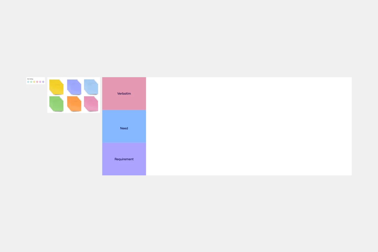
Identifying the voice of the customer is a crucial part of any customer experience strategy. Your Voice of Customer is simply a framework for understanding your customers’ needs, wants, preferences, and expectations as they interact with your brand. Evaluating your Voice of Customer allows you to dive into what your customers are thinking, feeling, and saying about your products and services, so you can build a better customer journey. Use the Voice of Customer template to record answers to key questions about your customer, including: What are they saying about our product? What do they need? How can we fulfill that need? And who is this persona?
Miro for AWS Well-Architected Framework Reviews
Works best for:
Diagramming, AWS
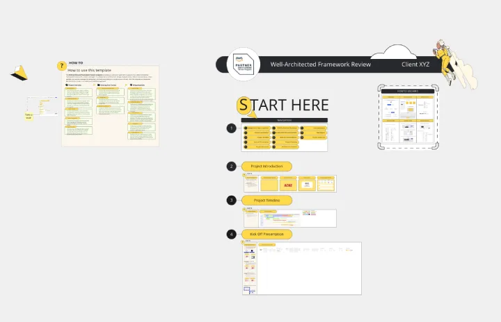
This AWS Well-Architected Framework Review (WAFR) template provides you and your team with a dedicated space to conduct a Well-Architected Framework Review with a client.
Syllabus Template
Works best for:
Education
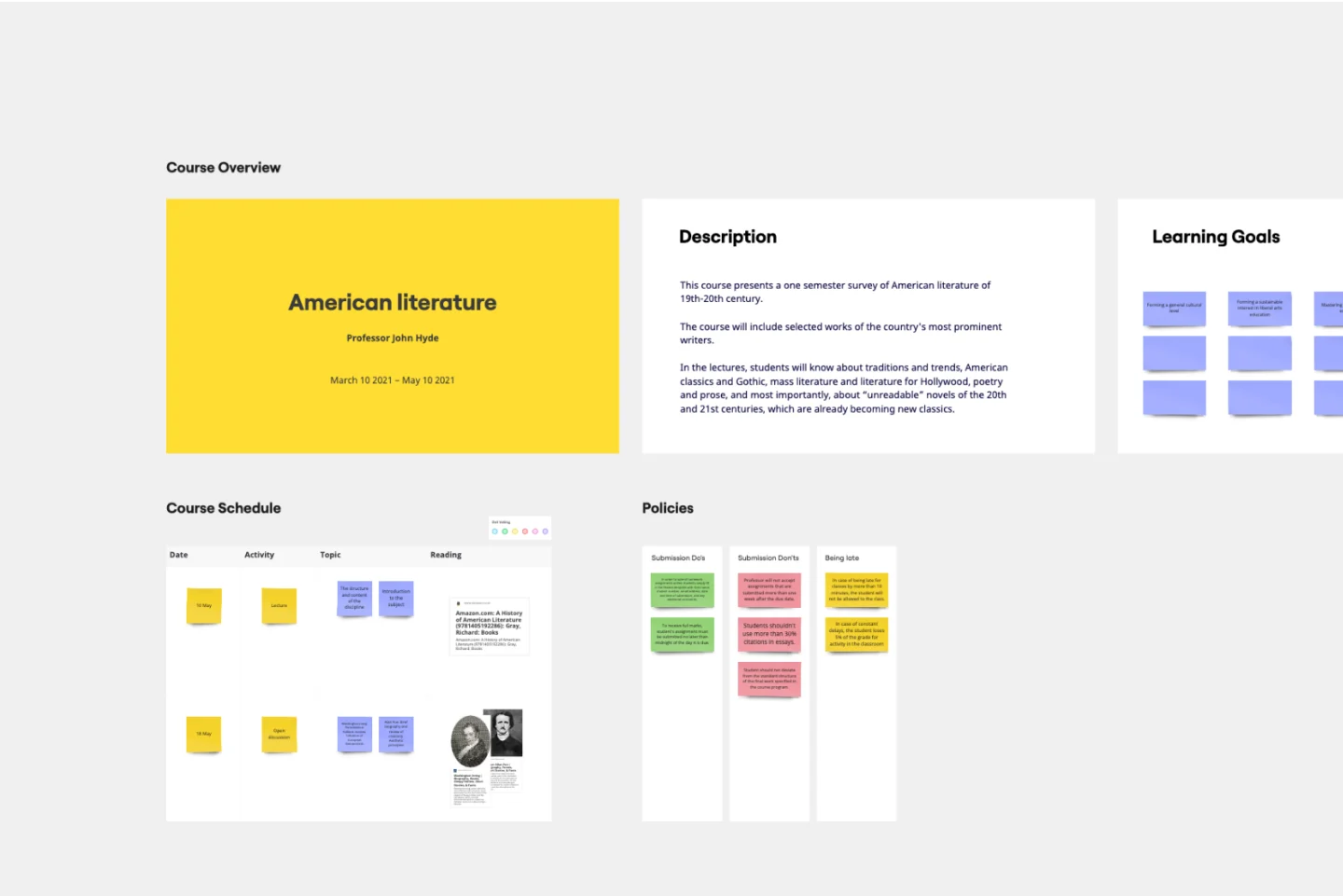
A Syllabus is a brief guide to your course, including expectations for your students, readings they will complete throughout the course, and a mission statement or course description. The Syllabus outlines any policies your students should follow during the course, rules and regulations that apply to them, and anything else your students should know. A Syllabus is a valuable tool for orienting your students, and it’s important the syllabus be clear and easy to follow. Use the Syllabus template to streamline the process of creating a simple, intuitive syllabus for your course.
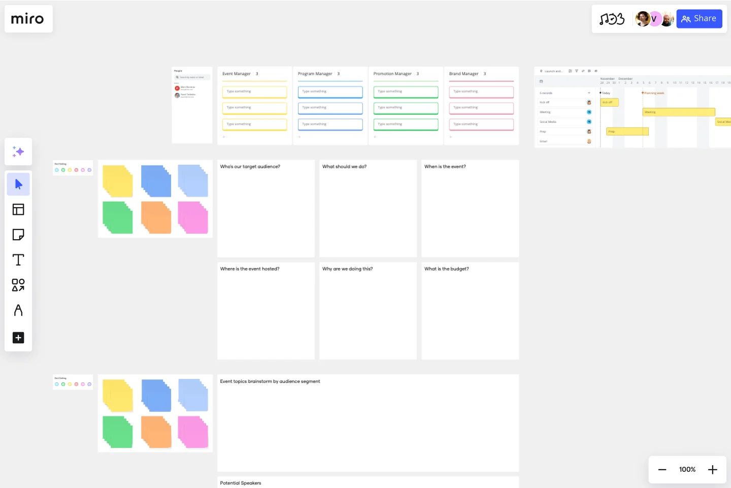
Event Planning Template
Works best for:
Planning, Workshops
Whether you’re planning a product launch, fully remote conference, or milestone event, the Event Planning Template will act as a visual checklist and map for all the details you need to consider before the big day. The Event Planning Template is an adaptable way to make sure the creative and strategic vision of your event doesn’t get lost in the details. By mapping out different sections - from the marketing plan, to the agenda, to snacks and swag for guests — you and your team can focus on the details most important to your functions, and collaborate as needed when overlaps occur.
Affinity Diagram by UserPeek
Works best for:
Diagramming
The Affinity Diagram template is a visual tool for organizing and categorizing ideas, data, or issues into related groups. It provides a structured framework for conducting group brainstorming and affinity grouping activities. This template enables teams to synthesize information, identify patterns, and generate insights collaboratively. By promoting creativity and collaboration, the Affinity Diagram empowers teams to organize and prioritize information effectively, driving decision-making and problem-solving processes efficiently.
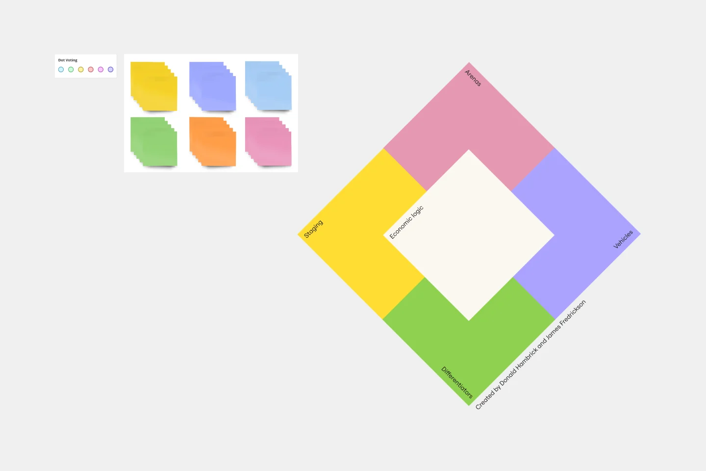
Strategy Diamond Template
Works best for:
Leadership, Operations, Strategic Planning
To achieve key objectives, every business assembles a series of strategies. But what elements should you consider when building a strategy? A strategy diamond is a collection of elements forming a coherent business strategy. These elements include: Arenas, Differentiators, Vehicles, Staging, and Economic Logic. Most strategic plans focus on just one or two of these elements, creating gaps that might cause problems for your business later on. A strategy diamond can help you stay focused and ensure you’re fulfilling all of your business’s needs rather than one or two.